Creating social media graphics can feel harder than it needs to be.
You open a blank design, add your logo, try three different fonts, move everything around and somehow end up less sure than when you started. Meanwhile, larger brands seem to publish polished content every day.
The good news is that you don’t need a design degree, an expensive software package or hours of spare time to create better posts. You simply need a few reliable principles and a repeatable process.
These social media graphic design tips will help you create content that looks professional, feels consistent and makes your message easier to understand. They’re designed for small businesses and startups, so you can put them into practice even on a limited budget or when you’re creating everything yourself.
- Why Better Social Media Graphics Matter
- 1. Give Every Graphic One Clear Job
- 2. Design for Small Screens First
- 3. Create a Clear Visual Hierarchy
- 4. Keep the Text Short and Useful
- 5. Use Your Brand Colours Consistently
- 6. Stick to One or Two Readable Fonts
- 7. Choose High-Quality Images That Feel Genuine
- 8. Give the Design Room to Breathe
- 9. Build Reusable Templates
- 10. Test, Learn and Improve
- How to Put These Social Media Graphic Design Tips Into Practice
- A Quick Checklist Before You Publish
- Better Graphics Start With Clearer Choices
Why Better Social Media Graphics Matter
Your social media graphics often create someone’s first impression of your business. Before a potential customer reads your caption, visits your website or asks about your services, they’ll notice how your post looks.
That doesn’t mean every graphic needs to resemble an award-winning advertising campaign. In fact, a simple design will often communicate more effectively than a complicated one.
Good social media graphics help people to:
- Notice your content.
- Understand your message quickly.
- Recognise your business.
- Remember what you offer.
- Take the next step.
Most importantly, good design makes your content easier to consume. It guides the viewer towards the main point instead of asking them to solve a visual puzzle.
So, where should you begin?
1. Give Every Graphic One Clear Job
Before you choose a template, font or image, decide what the graphic needs to achieve.
Do you want it to introduce a service, share a useful tip, promote an event or encourage people to visit your website? Pick one main purpose and let that purpose guide every design choice.
For example, imagine you want to advertise a free consultation. The date, offer and booking instructions matter. A long company history doesn’t. You can share extra detail in the caption or on the landing page.
If you try to make one post explain everything about your business, the result will probably feel crowded. However, when you focus on one message, people can understand it at a glance.
A quick planning question helps here: “What’s the one thing I want someone to remember after seeing this?” If you can’t answer in a sentence, simplify the idea before you start designing.
It also helps to plan a few repeatable themes, such as advice, customer stories, behind-the-scenes content and service highlights. These are often called content pillars. Our guide to how often small businesses should post on social media explains how content pillars can support a manageable posting routine.
2. Design for Small Screens First
You might create your graphics on a laptop, but many people will view them on a phone. Therefore, design for the smallest likely screen rather than the largest one available to you.
Use your chosen platform’s current design preset to get the right dimensions. Then, keep essential text and logos away from the edges because buttons, profile information or automatic cropping may cover them.
Once you’ve finished, view the design at roughly the size it will appear on a phone. Better still, send it to your phone and look at it in the relevant app. Can you read the headline without zooming in? Is the main image still clear? Does the message make sense in two or three seconds?
If the answer is no, make the text larger, remove something or increase the contrast. Don’t assume your audience will stop and zoom in. Most people won’t.
Finally, check each format separately. A square feed post, vertical story and landscape banner may need the same message, but they won’t need exactly the same layout. Reposition the elements instead of stretching or awkwardly cropping one design.
3. Create a Clear Visual Hierarchy
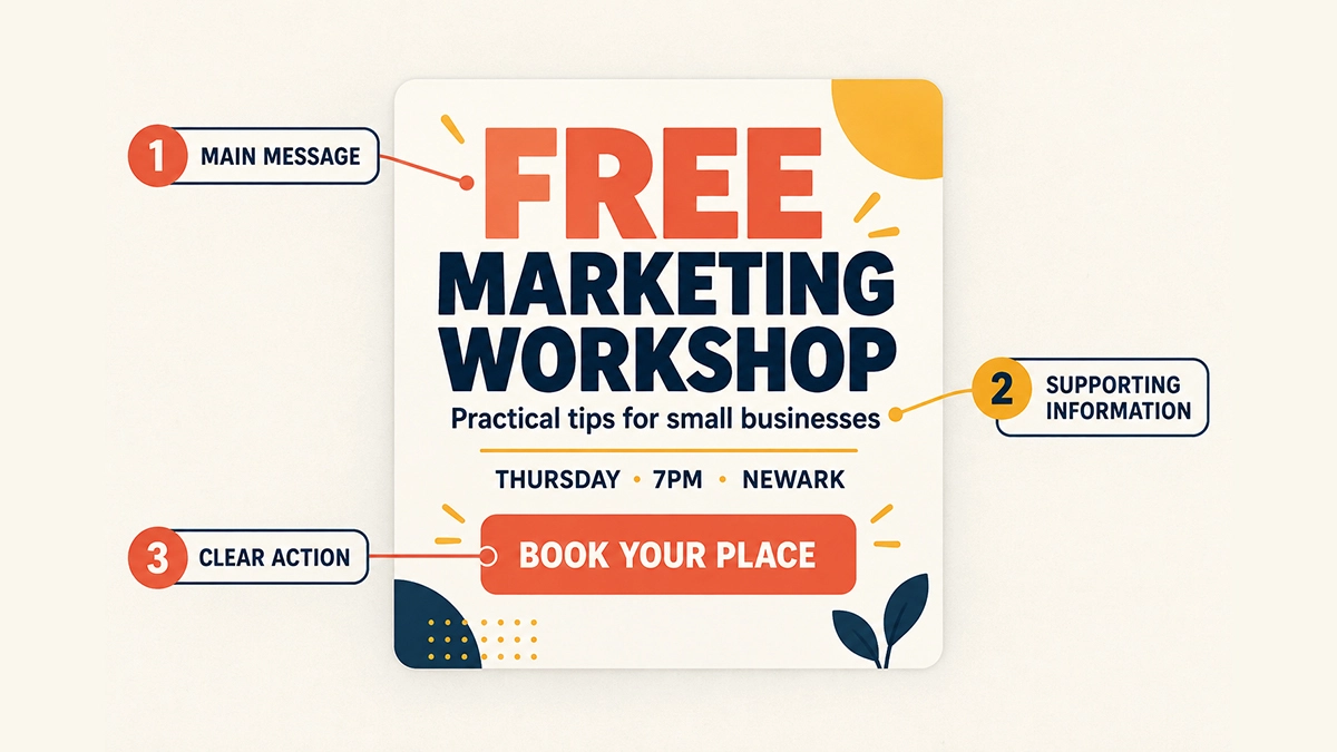
Visual hierarchy is simply the order in which people notice the elements in your design. It sounds technical, but the principle is straightforward: make the most important thing the easiest thing to see.
Start with a strong headline. Next, add any supporting information. Finally, include a small logo or call to action if the post needs one.
You can create hierarchy through:
- Size: Make the main message larger
- Weight: Use bold text for the most important words
- Colour: Add contrast to highlight a key detail
- Position: Place the main point where the eye naturally lands
- Space: Separate different pieces of information
For example, a workshop graphic might show “Free Marketing Workshop” as the largest text, followed by the date and location, with “Book Your Place” as a clear action. If the logo dominates while the useful information hides in a corner, the hierarchy isn’t doing its job.
Squint at your design or step back from the screen. What do you notice first? If it isn’t the main message, adjust the layout.
4. Keep the Text Short and Useful
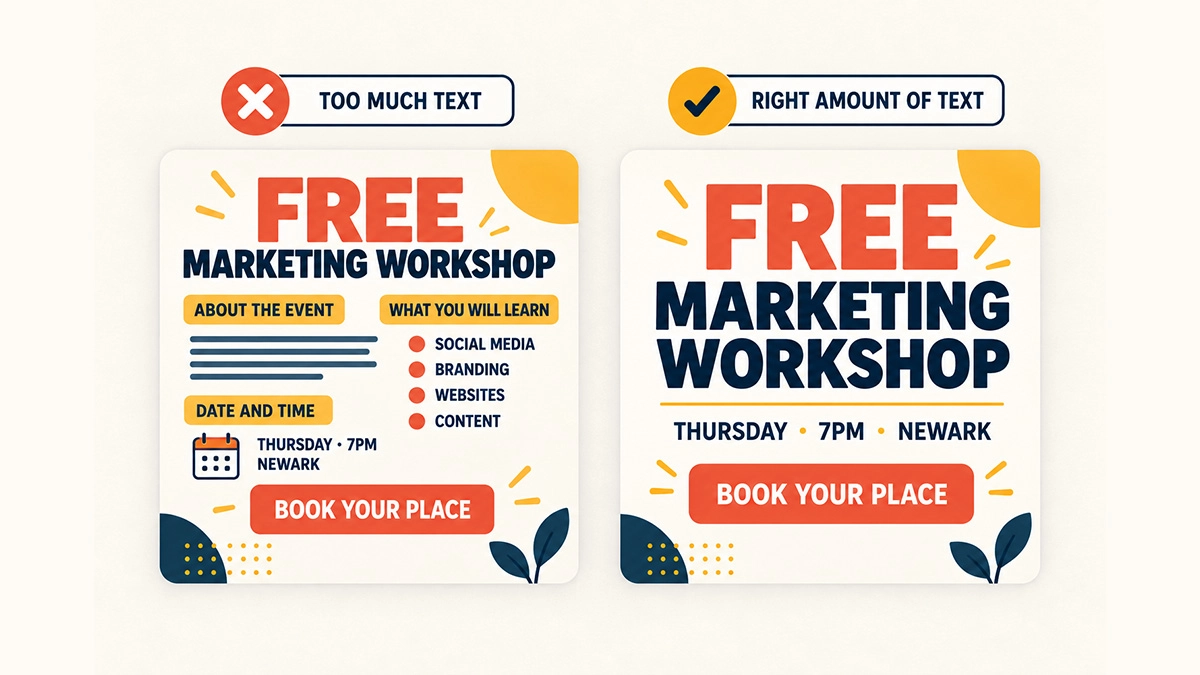
One of the most common social media design mistakes is trying to fit the entire caption into the graphic.
Too much text makes a design harder to scan and often forces you to use a smaller font. As a result, the post may look busy and become almost unreadable on a phone.
Instead, use the graphic to deliver the hook. Then, use the caption to explain the idea.
For instance, rather than adding six paragraphs about a common customer problem, use a headline such as “Three Signs Your Website Needs Attention”. You can place the three short points on a carousel or explain them in the caption.
You don’t need to remove every word. You just need to give each word a reason to be there. Delete repeated phrases, unnecessary labels and anything the image already communicates.
As a final check, read the design aloud. If the wording feels clumsy, shorten it. Clear writing usually leads to clearer design.
5. Use Your Brand Colours Consistently
Consistent colours help people recognise your content before they see your business name. They also stop you from choosing a completely new colour scheme every time you create a post.
Start with a small palette:
- One main brand colour.
- One supporting colour.
- One accent colour.
- One or two neutral colours, such as white, cream, grey or black.
You don’t have to use every colour in every post. Instead, use them in a consistent way. For example, your main colour might appear in backgrounds, while your accent colour highlights buttons, prices or key phrases.
Contrast matters too. Light grey text on a white background may look subtle on your laptop, but it won’t be easy to read. Likewise, don’t rely on colour alone to communicate meaning. Add labels, icons or patterns when people need another visual clue.
If you’re still choosing your palette, our guide to colour psychology in design can help you think about what different colours communicate. You can also read our practical advice on building a visual identity on a budget.
6. Stick to One or Two Readable Fonts
Fonts can give your brand personality. However, too many fonts can make one graphic look like several unrelated designs pushed together.
For most small businesses, two fonts are enough: one for headings and one for supporting text. You can create variety by changing the size or weight rather than introducing another typeface.
Above all, choose fonts people can read quickly. Decorative or handwritten fonts may suit a short heading, but they rarely work well for dates, prices or detailed information. If a font makes someone work to understand the message, it isn’t helping.
Keep these simple rules in mind:
- Avoid long sections of text in capital letters.
- Make important wording large enough for a phone screen.
- Use generous line spacing.
- Check that letters don’t disappear into the background.
- Keep the same font choices across your regular content.
Not sure what suits your brand? Our beginner-friendly guide to choosing the right website font covers readability, font personality and practical combinations. Although it focuses on websites, the same basic principles apply to social media graphics.
7. Choose High-Quality Images That Feel Genuine
Strong photography can do a lot of the design work for you. A clear product photo, a friendly team picture or an honest behind-the-scenes image can make a simple post feel personal and professional.
Where possible, use your own photographs. They show the real people, products and places behind your business. You don’t need a full studio setup either. Good natural light, a clean background and a steady phone can make a noticeable difference.
If you use stock photography, choose images that fit your audience and brand. Avoid pictures that feel overly staged or have little connection to the message. Your customers will find it easier to trust content that feels believable.
Whichever image you choose:
- Use a sharp, high-resolution file.
- Don’t stretch it out of proportion.
- Crop around the main subject carefully.
- Check that text remains readable over the image.
- Leave some uncluttered space if you plan to add a headline.
You can place a subtle colour overlay behind text when a busy photo reduces readability. However, don’t add an effect simply because the software offers it. Every edit should support the message.
8. Give the Design Room to Breathe
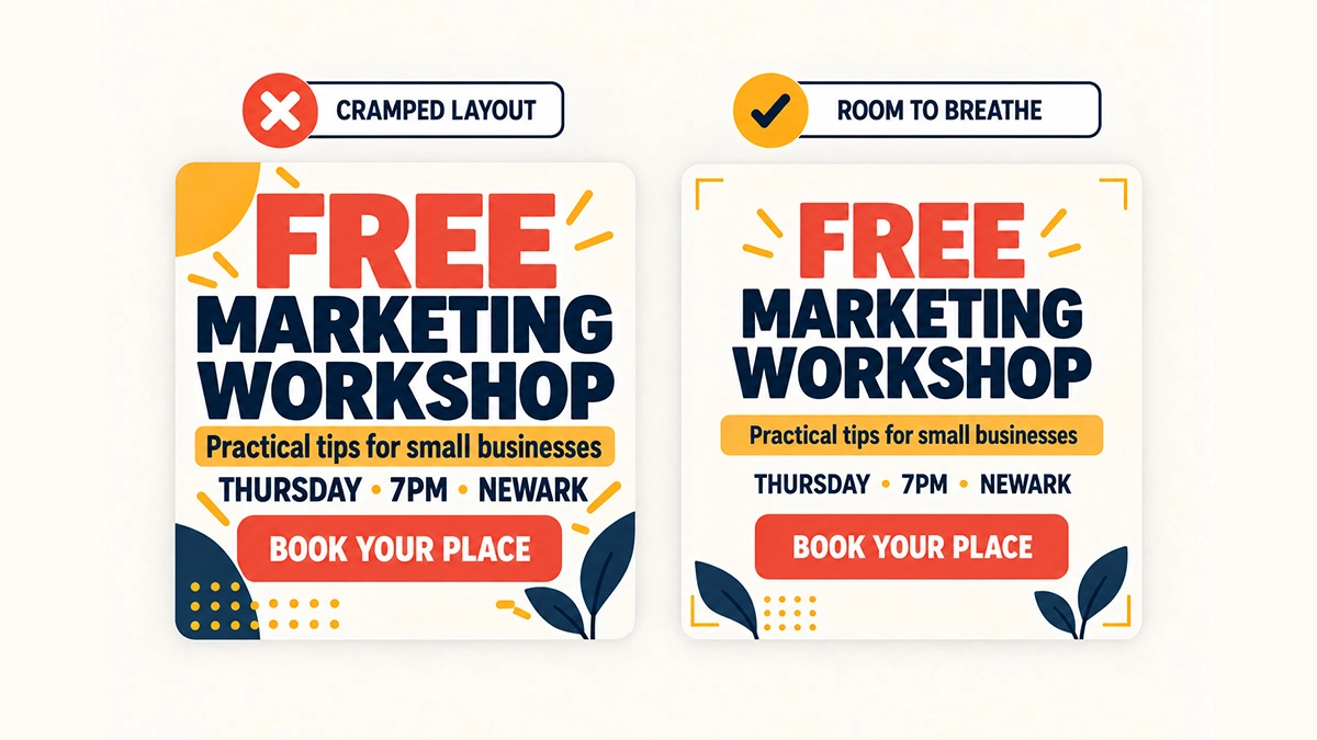
Empty space isn’t wasted space. It gives each element room to stand out and makes the design feel calmer.
When a graphic feels wrong, many beginners add another shape, icon or line. Often, the better solution is to remove something and increase the spacing.
Start by creating comfortable margins around the edge. Then, leave clear gaps between the headline, image, supporting text and call to action. Align related elements with one another so the design feels organised.
Most design tools include guides, grids and alignment controls. Use them. A few small adjustments can make a graphic feel much more polished, even when the viewer can’t explain why.
Also, avoid filling every corner with your logo, website address, phone number and social handle. Include the details people genuinely need. Your account name already appears beside most social posts, so you won’t always need to repeat it in the design.
When in doubt, remove one element and look again. Your message may become stronger.
9. Build Reusable Templates
Templates save time and help your content look consistent. They’re especially useful when one person handles social media alongside many other jobs.
Create a small set of templates for the posts you publish most often. You might need:
- A quick-tip graphic.
- A customer testimonial.
- A product or service spotlight.
- A promotional announcement.
- A carousel cover.
- A quote or key statistic.
Set up the correct colours, fonts, logo position and spacing in advance. Then, duplicate the closest template and replace the content whenever you need a new post.
However, don’t let a template become a rigid cage. Change the image, vary the layout or swap the background colour when the content needs it. Your posts should feel related, not identical.
If you’re deciding which software to use, take a look at our guide to Canva vs Illustrator for social media beginners. For many startups, a straightforward tool and a good template library will be more useful than complex software they don’t have time to learn.
10. Test, Learn and Improve
Design isn’t only about personal taste. A graphic needs to help the right people understand and respond to your content.
Therefore, pay attention to what happens after you publish. Look beyond likes and consider saves, shares, comments, website visits and enquiries. A simple educational carousel may create more useful engagement than a beautifully styled quote, even if the quote attracts a few quick likes.
Compare similar posts over time. Did a clear headline work better than a clever one? Did photographs perform better than illustrations? Did people respond when you added a direct call to action?
Change one main element at a time where possible. If you alter the message, format, colour, image and posting time all at once, you won’t know what made the difference.
At the same time, don’t chase every small fluctuation. Social media results can vary for many reasons. Look for patterns across several posts and use those patterns to improve your templates.
Finally, ask someone outside your business to look at a design for a few seconds. Then ask what they think it means. If their answer differs from yours, the graphic may need a clearer message.
How to Put These Social Media Graphic Design Tips Into Practice
These social media graphic design tips become much easier to follow when you turn them into a routine.
Try this simple process:
- Plan the message. Decide what the post needs to say and what action, if any, you want people to take.
- Choose the format. Pick a static post, carousel, story or another format that suits the idea.
- Select a template. Start with a trusted layout instead of a blank page.
- Add the essentials. Include the headline, image and supporting details.
- Simplify. Remove anything that doesn’t help the message.
- Check the design on your phone. Review the size, contrast, cropping and readability.
- Publish and review. Track the response and use what you learn next time.
Planning several posts together can also make the process feel less chaotic. Our free social media content calendar template can help you organise ideas, balance different types of content and avoid the last-minute “What should we post today?” panic.
A Quick Checklist Before You Publish
Before your graphic goes live, check the following:
- Does the post have one clear purpose?
- Can someone understand the main message quickly?
- Is the text readable on a phone?
- Have you used your brand colours and fonts?
- Is there enough contrast between the text and background?
- Does the image look sharp and relevant?
- Are the main elements aligned?
- Is there enough space around everything?
- Is the call to action clear?
- Have you checked the spelling, date, price and link?
That last check matters more than it sounds. A gorgeous event graphic with the wrong date still won’t do its job.
Better Graphics Start With Clearer Choices
You don’t need to use every design feature, follow every trend or make each post completely different. In fact, the strongest social media graphics usually come from a few clear choices repeated consistently.
Start with one message. Make it easy to read. Use your brand colours and fonts. Choose relevant images, leave enough space and review what works. Those simple habits will take you much further than adding more effects.
Most importantly, give yourself time to improve. Your first set of templates won’t be perfect, and that’s fine. Keep the useful parts, adjust the weak ones and build a system that suits your business.
Hopefully, these social media graphic design tips have given you a practical place to start. However, if creating content still takes too much time, you don’t have to do everything alone. Our social media services include branded templates and custom content designed around your business. Alternatively, if the bigger challenge is creating a consistent visual identity, explore our branding services.
Good social media design isn’t about making your business look bigger than it is. It’s about helping people understand who you are, what you offer and why they should care.