fbpx

10 Common Website Mistakes to Avoid: A Guide for Beginners

A view from behind a man sitting at desk with his his head in his hands and a laptop in front of him

Creating your own website is an exciting venture, whether you’re launching a blog, showcasing your portfolio, or starting an online business. for this reason, it’s important that you avoid these 10 common website mistakes to make sure that your website is a success

it’s easy to fall into common traps that can hinder your site’s success. To help you navigate this process, we’ve compiled a list of the top 10 website mistakes to avoid. By steering clear of these pitfalls, you’ll be well on your way to creating a website that not only looks great but also performs well.

  1. Ignoring Mobile Responsiveness
  2. Slow Loading Times
  3. Not designing for Accessibility
  4. Poor Navigation
  5. Using Poor Quality Images
  6. Lack of Clear Call-to-Actions (CTAs)
  7. Overcomplicating the Design
  8. Overlooking SEO Best Practices
  9. Failing to Secure Your Website
  10. Ignoring Analytics and User Feedback

1. Ignoring Mobile Responsiveness

On average, over 60% of Google searches happen on phones rather than a computer.  Meaning there is a strong likelihood that more of your website’s traffic is going to come from mobile devices.

With that in mind, it is important to design for mobile screens first and then adapt it to fit on desktops. This definitely has changed since the introduction of the internet, where in the 1990’s almost all internet searches would have been on a desktop computer.

The old way of building websites was to have two completely different versions. One that would display on computers and one that would show up on phones. That is a thing of the past, and now, web design has got to the stage where one version of your website should be enough to display across all different screen types and sizes. This is where ‘mobile responsiveness’ comes from.

A mobile-responsive design adjusts to different screen sizes, ensuring a seamless experience for all visitors.

Why It Matters:

If your website isn’t mobile-friendly, you risk losing a significant portion of potential visitors. Search engines like Google also prioritise mobile-friendly sites in their rankings, meaning a non-responsive site could hurt your SEO.

How to Fix It:

Most content management systems (CMS), like WordPress, are inherently designed to be mobile responsive. However, don’t take that for granted. If you are building your own website, make sure that you test it on as many devices as possible, and check that all the necessary elements are displaying correctly.

These are some of the most common screen sizes:

  • Desktop: 
    1920×1080, 1366×768, 1280×1024, 1024×768
  • Tablet: 
    768×1024, 1024×768, 601×962
  • Mobile: 
    375×667, 414×736, 360×800, 390×844

2. Slow Loading Times

How long it takes your website to load is something that is often overlooked, but is crucial for user experience and SEO.

Visitors expect websites to load quickly, and if your site takes too long, they may leave before even seeing your content.

It not only frustrates users but also negatively impacts your search engine rankings. Search engines like Google also use page speed as a ranking factor, meaning faster websites tend to rank higher in search results.

Slow-loading websites are a common byproduct of using ‘drag and drop’ page builders such as Elementor or Squarespace. The reason for that is the software is bloated with code for every different eventuality that you might want to incorporate in a website, whereas, in reality, you might only use 10% of the features.

Why It Matters:

Fast loading times enhance user experience, reduce bounce rates, and improve your SEO. Google uses page speed as a ranking factor, so a slow site can hurt your visibility.

How to Fix It:

Optimise your images, use a content delivery network (CDN), and minimise the use of heavy scripts and plugins. Free tools like Google PageSpeed Insights can help you identify areas for improvement.

Ideal Load Times:

  • Under 2 Seconds:
    Studies have shown that a website should ideally load within 2 seconds. After this point, the probability of users bouncing (leaving the site) increases dramatically.
  • 1 Second or Less:
    For an optimal user experience, aim for load times of 1 second or less, especially for mobile users. This speed is particularly important for e-commerce websites, where fast load times can significantly impact conversion rates.

How Do You Measure Your Website Speed?

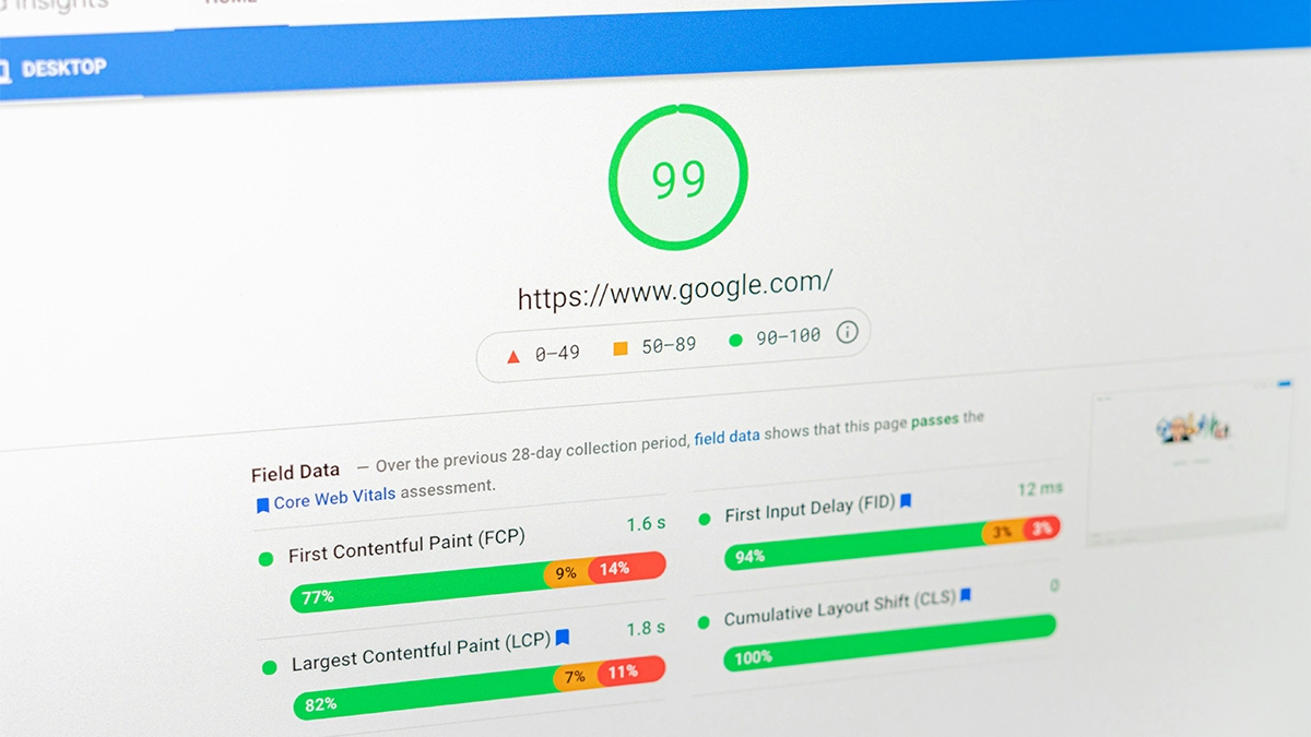
  1. Google PageSpeed Insights:
    This free tool analyses the content of your web pages and provides suggestions to make them faster. It gives separate scores for mobile and desktop performance.
  2. GTmetrix:
    Provides detailed insights on how well your website loads and offers recommendations for improving speed. It includes waterfall charts and performance scores.

3. Not designing for Accessibility

Designing for accessibility is crucial because it ensures that your website is usable and accessible to all users, including those with disabilities.

Google doesn’t necessarily consider accessibility as a factor when ranking your website, but it does consider the user journey. Websites that have taken accessibility into consideration tend to have better user experiences, leading to increased engagement, lower bounce rates, and improved SEO performance indirectly.

Accessibility encompasses a range of disabilities, including visual, auditory, physical, speech, cognitive, and neurological impairments.

Common Mistakes to Avoid

  1. Lack of Colour Contrast
    Low colour contrast between text and background makes content difficult to read for users with visual impairments or colour blindness.
    Follow WCAG (Web Content Accessibility Guidelines) standards for colour contrast ratios to ensure readability for all users. You can use online tools such as Adobe Color to check the accessibility of your colours.
  2. Ignoring Screen Reader Compatibility
    Websites without proper HTML structure and alternative text (alt text) for images may not be accessible to users relying on screen readers.
    Use semantic HTML5 elements, provide descriptive alt text for images, and ensure all interactive elements are keyboard accessible.
  3. Non-Responsive Design
    Websites that are not responsive may be inaccessible on mobile devices or for users who need to adjust text size or screen magnification.
    Implement responsive design principles to ensure your website adapts to various screen sizes and devices.
  4. Complex Navigation and Forms
    Complex navigation structures or forms without clear labels can confuse users with cognitive disabilities or impairments.
    Simplify navigation menus, use descriptive labels for links and form fields, and provide clear instructions to enhance usability.
  5. Video and Audio Accessibility
    Videos without captions or audio content without transcripts exclude users who are deaf or hard of hearing.
    Provide captions for videos, and transcripts for audio content, and ensure media players have accessible controls.

Understand Accessibility Guidelines

Familiarise yourself with the Web Content Accessibility Guidelines (WCAG) published by the World Wide Web Consortium (W3C). These guidelines provide a framework for making web content more accessible to users with disabilities.

WCAG outlines four principles that web content should be perceivable, operable, understandable, and robust (POUR). Each principle has specific guidelines and success criteria that outline best practices for accessibility.

4. Poor Navigation

Poor navigation is a common website mistake that can confuse visitors and drive them away. A well-structured, intuitive navigation system helps users find the information they need quickly and easily.

When designing your website’s navigation you have to consider it from your potential customer’s point of view. You might create something that you understand, being a subject matter expert, but consider someone who might not know anything about the subject and is landing on your website for the first time. How will they go about navigating it with some understanding?

For that reason, it is often good to follow trends and standard website design principles. For example, keep your main heading at the top of the screen and try limiting it to a maximum of 7 options.

Why It Matters:

Good navigation improves user experience and keeps visitors on your site longer, which can lead to higher engagement and conversions. It also helps search engines crawl and index your site more effectively.

How to Fix It:

Organise your content logically, use clear and descriptive menu labels, and ensure your navigation is accessible from all pages. Implement a search function for added convenience.

Examples of Poor Navigation in Website Design to avoid

1. Overly Complicated Menus

Menus with too many options or nested submenus can overwhelm visitors.
for Example: A website with a primary menu that has 20 items, each leading to multiple submenus, making it difficult for users to find the information they need quickly.

2. Hidden Navigation

Navigation that isn’t immediately visible or is hard to find can confuse users. You might think it is cool to incorporate a hamburger menu on the desktop version of your website, but this goes against what users would expect and can lead to them missing it altogether.
for Example: A website where the menu is hidden behind a small icon or only accessible after scrolling down, leading to users missing it entirely.

3. Inconsistent Navigation

Navigation elements that change or move around on different pages can disorient users.
for Example: A website where the main menu is at the top on some pages, on the side on others, and sometimes not present at all.

4. Broken Links and 404 Errors

Links that lead to non-existent pages or return errors can frustrate users and diminish trust in your site.
for Example: A website where multiple menu items lead to “404 Not Found” pages.

There are free tools such as Online Broken Link Checker that will check your website for any broken links. We recommend setting a reminder to do this at least once a month if you are posting content regularly.

5. Non-Descriptive Labels

Using vague or unclear labels for navigation links can leave users unsure of where the link will take them.
for Example: A website with menu items labelled “Stuff” or “Things” instead of descriptive terms like “Blog” or “Products.”

6. No Search Functionality

The lack of a search bar can make it difficult for users to find specific content, especially on larger sites.
for Example: An e-commerce site without a search bar, forcing users to navigate through multiple categories to find a specific product.

Good Navigation Tips and Common Practices

To ensure your website’s navigation is user-friendly and effective, follow these best practices:

1. Keep It Simple and Intuitive

Ensure your navigation is straightforward to understand.
Tip: Use clear, concise labels for your menu items. Organise them logically, grouping related items together.

2. Prioritise Key Pages

Highlight the most important pages to ensure they are easily accessible.
Tip: Place key pages like Home, About, Services, and Contact at the top level of your navigation menu.

3. Use Consistent Navigation

Maintain consistent navigation across all pages to avoid confusing users.
Tip: Keep the main menu in the same place on every page, using the same design and structure.

4. Ensure Mobile-Friendly Navigation

Design your navigation to work well on both desktop and mobile devices.
Tip: Use responsive design techniques to create mobile-friendly menus, such as drop-downs or hamburger menus.

5. Incorporate a Search Bar

Provide a search bar to help users quickly find what they’re looking for.
Tip: Place the search bar in a prominent location, typically at the top of the page or in the header.

6. Use Descriptive Labels

Make sure your navigation labels clearly indicate what users can expect to find on each page.
Tip: Use specific and descriptive terms like “Blog,” “Our Services,” “Product Categories,” and “Contact Us.”

7. Highlight the Current Page

Indicate the user’s current location within the site to help them understand where they are.
Tip: Use visual cues like highlighting the current menu item or using breadcrumb trails.

8. Limit Menu Items

Avoid overcrowding your main navigation menu with too many items.
Tip: Aim for a maximum of 7 main menu items. Use drop-downs or secondary menus for additional options.

9. Test for Usability

Regularly test your navigation to ensure it’s easy to use and meets user needs.
Tip: Conduct usability testing with real users to gather feedback on your navigation structure and make improvements.

10. Ensure Accessibility

Design your navigation to be accessible to all users, including those with disabilities.
Tip: Use semantic HTML for menus, provide keyboard navigation options, and ensure that navigation elements are screen reader-friendly.

5. Using Poor Quality Images

Using low-quality or irrelevant images is a common mistake that can detract from the overall appeal of your website. High-quality visuals are essential for creating a professional and engaging user experience.

Why It Matters:

Good images enhance your site’s aesthetic appeal, support your content, and can even improve your SEO if properly optimised. Poor images, on the other hand, can make your site look unprofessional and reduce user engagement.

How to Fix It:

Use high-resolution images that are relevant to your content. Optimise images for web use by compressing them to reduce file size without sacrificing quality. Always include descriptive alt text for accessibility and SEO benefits.

What Makes an Image Good Quality vs. Poor Quality for a Website?

  1. High Resolution
    Good quality images should have a high resolution (at least 72 DPI for web use, but higher if possible) to ensure they look sharp and clear on all devices, including high-resolution screens like Retina displays.
  2. Proper File Format
    Use the right file format for the image type. JPEG is ideal for photographs and complex images, PNG is good for graphics with transparency, and SVG is excellent for scalable vector graphics.
  3. Optimised for Web
    High-quality images should be optimised to reduce file size without losing visible quality. This helps with faster load times.
  4. Relevance
    Images should be relevant to the content and purpose of the website. They should enhance the user’s understanding and engagement with the content.
  5. Professional Composition
    Good quality images have proper composition, focus, lighting, and colour balance. They should look professional and visually appealing.
  6. Consistency
    Maintain a consistent style across all images on your site to ensure a cohesive look and feel.

Where to Find Good Stock Images

1. Free Stock Photo Websites

2. Paid Stock Photo Websites

6. Lack of Clear Call-to-Actions (CTAs)

Every website should have a discernible outcome that they want the user to reach:

  • for eCommerce the ultimate goal is to get the user to buy a product
  • a services website would want users to get in contact
  • even for blogs the goal may be for the user to sign up for a newsletter.

All websites have an end goal in mind, and clear and compelling call-to-actions (CTAs) are crucial for guiding visitors towards those desired actions.

One of the most significant website mistakes to avoid is not having frequent and prominent CTAs.

Why It Matters:

Effective CTAs improve user engagement and conversion rates by providing clear instructions on what to do next. Without them, visitors may leave your site without taking any action.

How to Fix It:

Place CTAs strategically throughout your site, using action-oriented language that tells visitors exactly what to do. Ensure your CTAs stand out visually and are easy to find.

Tips for Creating Effective CTAs

  1. Use Action-Oriented Language
    CTAs should use strong action verbs that encourage users to take immediate steps, such as “Get,” “Download,” “Join,” “Start,” and “Discover.”
  2. Be Clear and Specific
    Make sure the CTA clearly communicates what the user will get or what action they are taking. Avoid vague language.
  3. Highlight Benefits
    Explain what the user will gain by clicking on the CTA. Whether it’s gaining access to exclusive content, a free trial, or a helpful resource, make it clear.
  4. Create a Sense of Urgency
    Phrases like “Now,” “Today,” “Limited Time,” or “Within 24 Hours” can encourage users to act quickly.
  5. Ensure Visibility
    Your CTA should stand out on the page. Use contrasting colours, larger fonts, or buttons to make sure it catches the user’s eye.
  6. Place Strategically
    Position your CTA where users are most likely to see and interact with it, such as at the end of a blog post, in the header or footer, or prominently on a landing page.

Examples of Good Call-to-Action (CTA)

A strong call-to-action (CTA) is essential for guiding users toward desired actions on your website. Here are several examples of effective CTAs along with tips for creating them:

1. “Sign Up for Our Newsletter”

Button Text:
“Join Our Community!”

Supporting Text:
“Subscribe to our newsletter to receive the latest updates, tips, and exclusive content straight to your inbox.”

Call to action to "Join our community!"

Why It Works:

  • Clear and Compelling:
    The CTA clearly states what the user will get (latest updates, tips, exclusive content).
  • Action-Oriented:
    Uses action verbs like “Join” and “Subscribe.”
  • Value Proposition:
    Emphasises the benefits of subscribing.

2. “Get Started for Free”

Button Text:
“Start Your Free Trial”

Supporting Text:
“Experience all the features of our premium plan for 30 days, no credit card required.”

Call to action to "Start your free trial"

Why It Works:

  • Low Barrier to Entry:
    Offers a free trial with no immediate cost.
  • Action-Oriented:
    Uses a strong action verb (“Start”).
  • Specific Benefit:
    Highlights the trial period and lack of commitment required (no credit card needed).

3. “Shop Now

Button Text:
“Shop Our Latest Collection”

Supporting Text:
“Discover the newest arrivals and find your perfect look.”

Call to action to "Shop our latest collection"

Why It Works:

  • Immediate Action:
    Encourages users to take immediate action to shop.
  • Clear and Direct:
    Simple and straightforward command.
  • Appealing:
    Uses enticing words like “latest” and “perfect.”

7. Overcomplicating the Design

While it can be tempting to use flashy designs and lots of features, overcomplicating your website can overwhelm visitors and detract from the user experience. Simplicity is often more effective.

That is not to say that you need to make your website look boring, or bog-standard, but there is a fine balance to be struck.

Why It Matters:

A clean, simple design is easier for users to navigate and understand. It also loads faster and looks more professional. Overcomplicated designs can slow down your site and make it harder for visitors to find what they’re looking for.

How to Fix It:

Make use of ‘white space’, clear typography, and a straightforward layout. Prioritise functionality over aesthetics and avoid unnecessary elements that could clutter your site.

Key Characteristics of Simplicity in Web Design:

  • Ample White Space:
    Allows content to breathe and improves readability.
  • Clear Navigation:
    Intuitive menu and navigation elements for easy browsing.
  • Consistent Visual Language:
    Uniformity in typography, colour scheme, and design elements.
  • Focused Messaging:
    Concise and clear communication of key information or product benefits.
  • User-Centric Design:
    Prioritising user needs and usability throughout the website.

8. Overlooking SEO Best Practices

Search engine optimisation (SEO) is a hot topic among businesses that are looking to drive traffic to their website without having to pay for ads.

One of the biggest website mistakes to avoid is neglecting SEO, which can make it difficult for potential visitors to find your site.

SEO is a vast and complicated subject, but what we are covering in this post is the technical aspects of SEO that you need to consider when creating your website, rather than the content you are generating.

Why It Matters: 

Good SEO practices improve your site’s visibility in search engine results, leading to more traffic and potential customers. Without proper SEO, your site may struggle to attract visitors.

How to Fix It: 

Conduct keyword research to find relevant terms for your content, use these keywords strategically in your titles, headings, and content, and ensure your site is technically optimised with clean URLs, proper meta tags, and a sitemap.

Quick overview of SEO

  1. On-Page SEO
    Title Tags: Include relevant keywords in your title tags (<title> tag).
    Meta Descriptions: Write compelling meta descriptions that summarise your page content and encourage clicks.
    Headers (H1, H2, H3): Use headers to structure your content logically and include keywords where appropriate.
    URL Structure: Use clean, descriptive URLs that include keywords if possible.
  2. Technical SEO
    Ensure your website is mobile-friendly and loads quickly.
    Optimise images with alt text to describe them to search engines.
    Use HTTPS to secure your website.
  3. User Experience (UX)
    Improve user experience with clear navigation, easy-to-read content, and fast loading times.
    Reduce bounce rates by providing relevant and engaging content.
  4. Link Building
    Build high-quality backlinks from reputable and relevant websites.
    Internal linking: Link related content within your site to improve navigation and spread link equity.
  5. Local SEO (if applicable)
    Optimise your website for local search if you have a physical location.
    Claim and optimise your Google My Business listing.

9. Failing to Secure Your Website

Website security is paramount, and failing to secure your site is one of the most serious mistakes you can make. A security breach can lead to data loss, legal issues, and a damaged reputation.

Certain security features, such as an SSL certificate, will also impact your Google search rankings. Some devices won’t even allow users to load un-secure websites for security reasons, so you could be missing out on potential traffic.

Why It Matters: 

A secure website protects your data and your visitors’ information. Security breaches can have severe consequences, including loss of trust and potential financial losses. Search engines also prioritise secure sites in their rankings.

How to Fix It: 

Implement strong security measures, such as using HTTPS, regularly updating your software and plugins, and using strong, unique passwords. Consider using security plugins and services to monitor and protect your site from threats.

How To Secure Your Website

1. Use HTTPS

Make your website uses HTTPS (Hypertext Transfer Protocol Secure) instead of HTTP. HTTPS encrypts the data transmitted between the user’s browser and your website, protecting it from interception by malicious actors.

install an SSL (Secure Sockets Layer) certificate from a trusted Certificate Authority (CA) to enable HTTPS. Many web hosting providers offer free SSL certificates through services like Let’s Encrypt.

Software:
Typically, you don’t need additional software for SSL/TLS certificates. Most web hosting providers offer integration with Let’s Encrypt or provide their own SSL management tools.

2. Keep Software Updated

Keep your Content Management System (CMS), such as WordPress, Joomla, or Drupal, and any plugins or themes, up to date with the latest security patches and updates.

Ensure server software (e.g., Apache, Nginx, MySQL) is also updated to the latest stable versions to address security vulnerabilities.

Software:

3. Strong Passwords and Authentication

Enforce strong password policies for user accounts, requiring a combination of uppercase and lowercase letters, numbers, and special characters.

Implement MFA for admin and user logins where possible. This adds an extra layer of security by requiring users to verify their identity with additional information (e.g., a code sent to their phone).

Software:

4. Regular Backups

Regularly back up your website and its data to an external location or cloud service. This ensures you can restore your website quickly in case of data loss or a security breach.

Use automated backup solutions provided by your web hosting provider or third-party services to simplify the process.

Software:

5. Security Plugins and Tools

Install a web application firewall (WAF) to monitor and filter HTTP traffic to and from your website, blocking malicious requests and attacks.

Depending on your CMS, install security plugins that offer features such as malware scanning, file integrity monitoring, and brute-force attack protection.

Software:

10. Ignoring Analytics and User Feedback

Ignoring website analytics and user feedback is a critical mistake that can prevent you from understanding how your site is performing and where improvements are needed.

As a business owner, focusing on specific website analytics can provide valuable insights into the performance of your website and help you make informed decisions to improve user experience, conversions, and overall business growth.

Why It Matters: 

Analytics provide valuable insights into visitor behaviour, traffic sources, and page performance. User feedback helps you identify pain points and areas for improvement. Together, they guide your optimisation efforts.

How to Fix It: 

Use tools like Google Analytics to track your site’s performance and gather data on user behaviour. Regularly review this data to identify trends and areas for improvement. Encourage user feedback through surveys, comments, and contact forms.

What Insights To Look At

1. Traffic Sources

Understand where your website visitors are coming from.

Importance: Helps identify which channels are driving traffic and where to focus your marketing efforts.

Key Metrics:

  • Organic Search:
    Visitors from search engines like Google, Bing, etc.
  • Direct Traffic:
    Visitors who directly type your URL into their browser.
  • Referral Traffic:
    Visitors from other websites link to yours.
  • Social Traffic:
    Visitors from social media platforms like Facebook, Twitter, etc.
2. Audience Overview

Understand your website visitors’ demographics and behaviour.

Importance: Provides insights into your audience’s size, behaviour patterns, and engagement levels.

Key Metrics:

  • Unique Visitors:
    Number of distinct individuals visiting your site.
  • Sessions:
    Total number of visits to your site.
  • Pageviews:
    Total number of pages viewed across all visits.
  • Bounce Rate:
    Percentage of single-page sessions (visits where the user left your site after viewing only one page).
3. Conversion Rate

Measure the percentage of visitors who complete a desired action (e.g., making a purchase, or filling out a contact form).

Importance: Helps gauge the effectiveness of your website in driving desired actions and ROI.

Key Metrics:

  • Goal Completions:
    Number of times a specific goal (e.g., completing a purchase, signing up for a newsletter) is achieved.
  • Conversion Rate:
    Percentage of visitors who complete a goal.
4. Top Pages

Identify which pages on your website attract the most traffic.

Importance: Helps prioritise content optimisation efforts and understand what resonates most with your audience.

Key Metrics:

  • Pageviews:
    Total number of views for each page.
  • Average Time on Page:
    Average amount of time visitors spend on each page.
5. Device and Browser Usage

Understand how visitors access your website (desktop, mobile, tablet) and which browsers they use.

Importance: Guides responsive design and optimisation efforts for different devices and browsers.

Key Metrics:

  • Desktop vs. Mobile vs. Tablet Traffic:
    Percentage breakdown of traffic by device type.
  • Top Browsers:
    Most commonly used web browsers by visitors.
6. Traffic Behaviour Flow

Visual representation of how users navigate through your site.

Importance: Helps optimise navigation and user experience to reduce bounce rates and improve conversion paths.

Key Metrics:

  •  Flow Visualisation:
    Path users take from one page or event to the next.
  •  Drop-off Points:
    Identify where users exit your site or abandon the conversion funnel.
7. SEO Performance

Measure your website’s visibility and performance in search engine results.

Importance: Guides SEO strategies and optimisations to improve search engine rankings and attract more organic traffic.

Key Metrics:

  • Keyword Rankings:
    Track rankings for target keywords.
  • Organic Traffic:
    Traffic generated from organic search results.
  • Click-Through Rate (CTR):
    Percentage of users who click on your website link in search results.
8. Site Speed

Measure how quickly your website loads for users.

Importance: Affects user experience, bounce rates, and SEO rankings. Faster loading times generally lead to better user engagement and conversions.

Key Metrics:

  • Page Load Time:
    Average time it takes for your website pages to load.
  • Page Size:
    Total size of your webpage in kilobytes (KB) or megabytes (MB).
  • Performance Scores:
    Scores provided by tools like Google PageSpeed Insights or GTmetrix.
9. Referral Sources

Identify which external websites are referring traffic to your site.

Importance: Helps identify effective partnerships, influencers, or websites that drive traffic and conversions.

Key Metrics:

  • Referral Traffic:
    Number of visits from each referral source.
  • Conversion Rate by Referral Source:
    Percentage of visitors from each referral source who convert.
10. Social Media Metrics

Measure the effectiveness of your social media efforts in driving traffic to your website.

Importance: Guides social media strategy and content planning to optimise engagement and traffic generation.

Key Metrics:

  • Social Traffic:
    Traffic generated from social media platforms.
  • Engagement:
    Likes, shares, comments, and other interactions on social media posts linking to your site.

10. Not Updating Content Regularly

Stale or outdated content can make your website look neglected and reduce its effectiveness. Regularly updating your content is important for keeping your site relevant and engaging.

Why It Matters: 

Fresh content keeps visitors coming back and improves your SEO, as search engines favour sites that are regularly updated. Outdated content can give the impression that your site is not maintained, which can drive visitors away.

How to Fix It: 

Set a schedule for updating your content, whether it’s through blog posts, news updates, or refreshing existing pages. Monitor your content for accuracy and relevance, and make updates as needed.

How Often You Should Update Your Website

How often you update your website will depend on your type of website and your digital content strategy.

  1. Regular Updates:
    Aim to update your website content regularly to keep it fresh and engaging for your audience. This could range from weekly to monthly updates, depending on your content strategy and resources. If your website is key in your digital marketing efforts then a good minimum is to at least refresh or create new content every month.
  2. Critical Updates:
    Certain types of content may require more frequent updates. For example, product information, pricing, and company news should be updated as soon as changes occur.
  3. Seasonal or Event-Based Updates:
    Plan updates around seasonal promotions, events, or holidays relevant to your business. This helps capitalise on timely opportunities and maintain relevance.

Using our own website as an example, we batch our website content into one of two categories, either cornerstone content or not. For all our cornerstone pages, those that we feel make up the bedrock of our website and provide the most valuable insight to our users, we aim to make meaningful updates to these every 6 months.

How Much You Should Update Each Time

  1. Focus on Quality:
    Quality of updates is more important than quantity. Ensure that each update provides value to your audience, whether through new information, improved user experience, or enhanced SEO.
  2. Prioritise Key Pages:
    Focus updates on high-traffic or key conversion pages first. These could include a homepage, product/service pages, and landing pages.
  3. Content Types:
    Update various types of content, including text, images, videos, and infographics, to cater to different audience preferences and improve engagement.

Conclusion

Avoiding these common website mistakes is essential for creating a successful and user-friendly site. By focusing on mobile responsiveness, fast loading times, clear navigation, and other key factors, you can enhance your site’s performance and user experience. Remember, a well-designed and well-maintained website is crucial for attracting and retaining visitors. So take the time to address these potential pitfalls and ensure your website stands out for all the right reasons.

By implementing these tips, you’ll be well on your way to creating a website that not only meets but exceeds your visitors’ expectations. Happy website building!

Share
Scroll to Top