Most websites look reasonably good at first glance. However, looking good and being easy to use aren’t always the same thing.
A website can have strong branding, attractive photographs and impressive effects, yet still leave visitors wondering what the business does or where they should click next. When that happens, the problem usually comes down to the website user experience, often shortened to UX.
Good website UX makes things feel straightforward. Visitors can understand your offer, find the information they need and take the next step without having to work it out for themselves.
The good news is that you don’t need to be a UX designer to spot many of the most common problems. In this guide, we will explain what UX means in web design and share ten practical ways to improve the user experience on your website.
- What is Website User Experience?
- Why Does Website UX Matter for a Small Business?
- How To Improve Your Website User Experience
- 1. Make Your Offer Clear Immediately
- 2. Simplify the Website Navigation
- 3. Give Every Page a Clear Next Step
- 4. Make the Content Easy to Scan and Understand
- 5. Design for Mobile Users
- 6. Improve Website Speed and Stability
- 7. Use a Consistent Visual Hierarchy
- 8. Build Accessibility Into the Experience
- 9. Remove Friction from Forms and Checkout
- 10. Test the Website with Real People
- Common Website UX Mistakes to Avoid
- How Can You Tell Whether Your Website Has Poor UX?
- Useful Tools for Checking Website User Experience
- Final Thoughts
What is Website User Experience?
Website user experience describes the overall experience someone has while using your website.
It includes questions such as:
- Does the website load quickly?
- Is it clear what the business offers?
- Can visitors find important pages easily?
- Is the content straightforward to read?
- Does the website work properly on a phone?
- Are forms, buttons and checkout steps easy to use?
- Does the experience feel trustworthy and consistent?
UX in web design isn’t only about appearance. The visual interface, sometimes called the UI, forms part of the experience, but UX looks at the complete journey.
Imagine walking into a beautifully decorated shop where the signs are unclear, the aisles lead nowhere, and nobody can find the till. It might look the part, but it would still be frustrating to use. A website works in much the same way.
Why Does Website UX Matter for a Small Business?
Your website often meets a potential customer before you do. If it feels confusing, slow or unreliable, that experience can affect how they view the business itself.
A user-friendly website can help you:
- Make a stronger first impression.
- Help visitors understand your services more quickly.
- Build trust in your business.
- Reduce abandoned forms and baskets.
- Generate more relevant enquiries or sales.
- Make your content accessible to more people.
- Encourage visitors to explore other useful pages.
UX can also support your wider search performance. Google recommends providing a good page experience and uses Core Web Vitals within its ranking systems. But a strong performance score alone doesn’t guarantee high rankings. Useful content, relevance and many other factors still matter.
In other words, don’t improve website UX purely for Google. Improve it because it makes the website more useful to the people you want to reach.
How To Improve Your Website User Experience
You don’t necessarily need a complete redesign. Sometimes, a series of focused changes can make a substantial difference.
Start with the parts of the website connected to your most important customer journey. For a service business, that might be the journey from a service page to an enquiry form. For an online shop, it could run from a product category to checkout.
The following ten areas will give you a practical place to begin.
1. Make Your Offer Clear Immediately
When someone lands on your homepage, they should be able to work out what you do, who you help and what they can do next.
This doesn’t mean squeezing every detail into the top of the page. It means giving visitors enough context to know that they are in the right place.
A clear opening section will normally include:
- A heading that describes the main service or benefit.
- A short explanation that adds useful context.
- Relevant images rather than a generic stock photograph.
- A visible next step, such as viewing services or requesting a quote.
Avoid relying on clever but vague headlines. A line such as “Ideas without limits” might sound appealing, but it doesn’t tell a first-time visitor what the business actually offers.
Clarity is especially important when people arrive on an internal service page from Google. They may never see your homepage, so every important landing page needs to make sense on its own.
2. Simplify the Website Navigation
Your menu should help people find their way around, not make them decode how the website has been organised.
Use familiar, descriptive labels such as Services, About, Case Studies and Contact. Creative alternatives can work in the right context, but clarity should come first.
It is also worth checking whether every item deserves a place in the main menu. Too many choices can make the important pages harder to spot.
For a straightforward small-business website, consider:
- Keeping the main navigation focused on key pages.
- Grouping related services beneath a clear heading.
- Making the current page easy to identify.
- Providing an obvious route back to the homepage.
- Including an accessible mobile menu.
- Adding search functionality if the website contains a large amount of content or products.
Don’t assume the navigation works because you know where everything is. You helped build the structure; a new visitor didn’t.
3. Give Every Page a Clear Next Step
Every important page should help the visitor move forward.
That next step will vary. It might be to:
- View a related service.
- Compare options.
- Read a case study.
- Add a product to the basket.
- Book an appointment.
- Complete an enquiry form.
- Call or email the business.
Calls to action should be easy to recognise and specific enough to understand. “Get a quote” or “View our website packages” gives visitors more information than a vague button saying “Click here”.
Placement matters too. A useful call to action near the top of the page helps visitors who are ready, while another after the main information gives everyone else a natural next step.
However, more buttons don’t automatically create a better experience. If every section shouts a different instruction, the page can feel confused. Decide which action matters most and make that the visual priority.
4. Make the Content Easy to Scan and Understand
Website visitors rarely read every word in order. They scan headings, look for relevant phrases and decide which sections deserve more attention.
Make that process easier by using:
- Descriptive headings and subheadings.
- Short, focused paragraphs.
- Bullet points for genuine lists.
- Plain English wherever possible.
- Helpful links with meaningful anchor text.
- Enough spacing between sections.
- A readable font size and line length.
Avoid treating longer copy as the enemy. A page can contain plenty of useful detail and still provide a good user experience if it is structured properly.
The bigger problem is often unclear copy. Industry language that feels normal to you may mean very little to a potential customer. Explain the service in the words customers use, then introduce technical detail only where it helps them make a decision.
5. Design for Mobile Users

A responsive website adjusts to different screen sizes, but that doesn’t automatically mean the mobile experience is good.
Open the website on a real phone and try to complete the same actions as a customer. Check whether:
- The text is comfortable to read without zooming.
- Buttons and links are easy to tap.
- Forms are manageable with a mobile keyboard.
- Menus open and close properly.
- Images fit without being awkwardly cropped.
- Pop-ups do not block the screen.
- Important information appears in a sensible order.
- Telephone numbers and email addresses are easy to use.
Don’t only shrink the desktop design. Mobile users may need a more focused version of the same journey. For example, a prominent tap-to-call button might be genuinely useful on a local service website but unnecessary on desktop.
Test more than the homepage. Service pages, contact forms, product filters, baskets and account areas often reveal problems that a quick homepage check misses.
6. Improve Website Speed and Stability
A slow or unstable website creates friction before visitors have even begun reading.
Common causes include oversized images, excessive plugins, heavy animation, poorly optimised video, weak hosting and unnecessary third-party scripts.
Practical improvements may include:
- Resizing and compressing images before uploading them.
- Using modern image formats where suitable.
- Avoiding videos that load automatically without a good reason.
- Removing plugins and scripts the website no longer needs.
- Using caching and a content delivery network where appropriate.
- Choosing hosting that suits the website rather than price alone.
- Reserving space for images and banners so the page doesn’t jump while loading.
Google PageSpeed Insights can help identify performance issues on mobile and desktop. Its Core Web Vitals assessment looks at loading performance, responsiveness and visual stability based on real-world user data when enough information is available.
Treat the results as diagnostic information rather than chasing a perfect score. The aim is a website that feels quick and dependable for real visitors.
7. Use a Consistent Visual Hierarchy
Visual hierarchy tells people what matters most on a page.
Headings, colour, spacing, imagery and placement all help guide attention. When every element is the same size or every button uses a different style, visitors have to work harder to understand the page.
A consistent hierarchy might include:
- One clear main heading for the page.
- Subheadings that organise related content.
- A recognisable style for primary buttons.
- A quieter style for secondary actions.
- Consistent spacing between similar sections.
- Repeated layouts for similar types of information.
Consistency helps visitors learn how the website works. If blue text indicates a link on one page but acts as a decorative heading on another, the interface becomes less predictable.
This doesn’t mean every page needs to look identical. It means the underlying design rules should remain familiar.
8. Build Accessibility Into the Experience
An accessible website is designed so that more people can understand and use it, including visitors with visual, hearing, motor or cognitive impairments.
Accessibility is a broad subject, but useful starting points include:
- Providing enough contrast between text and its background.
- Adding meaningful alternative text to informative images.
- Using headings in a logical order.
- Making the website usable with a keyboard.
- Giving form fields visible, descriptive labels.
- Adding captions or transcripts to video content.
- Avoiding text embedded inside images where possible.
- Writing links that make sense out of context.
- Not relying on colour alone to communicate meaning.
Accessibility shouldn’t be treated as a final check added after the design is finished. It’s part of creating a good website user experience from the beginning.
Many accessibility improvements benefit everyone. Captions help someone watching a video in a quiet waiting room, clear labels make forms easier for all visitors, and good contrast helps anyone using a phone in bright sunlight.
9. Remove Friction from Forms and Checkout

Forms often sit at the most important point in the customer journey. Unfortunately, they are also where many websites create unnecessary work.
Review each form field and ask whether you genuinely need that information at this stage. A first enquiry may only require a name, contact details and a short message. You can collect further information during the conversation.
Good forms should:
- Use clear labels and instructions.
- Mark required and optional fields accurately.
- Explain errors next to the relevant field.
- Preserve information when an error occurs.
- Work well on mobile devices.
- Confirm that the submission was successful.
- Set expectations about what happens next.
The same principle applies to ecommerce checkout. Unexpected costs, forced account creation, confusing delivery choices and too many steps can all make customers reconsider.
Complete your own forms and checkout regularly. A small technical change or plugin update can introduce a problem without it being immediately obvious.
10. Test the Website with Real People
You can’t judge the entire website experience from inside the business.
Ask someone who resembles your target customer to complete a simple task, such as finding a particular service, locating a price or submitting an enquiry. Give them the goal but don’t tell them where to click.
Watch what they do. Note where they pause, go backwards, choose an unexpected option or ask for clarification. Their behaviour is often more useful than a general comment that the website “looks nice”.
You can also use evidence from:
- Website analytics.
- Search data.
- Form completion and abandonment.
- Customer questions.
- On-site search terms.
- Heatmaps and session recordings.
- Direct customer feedback.
Tools can show patterns, but they still need interpretation. A visitor leaving a page isn’t automatically evidence of bad UX; they may simply have found the telephone number they needed. Start with the purpose of the page and judge behaviour in that context.
Common Website UX Mistakes to Avoid
Some problems appear repeatedly on small-business websites:
- Too much information competing for attention:
Trying to display every service, offer and announcement at once can make the important message disappear. Give the page a clear priority and allow the content room to breathe. - Pop-ups that interrupt visitors:
Cookie banners, newsletter prompts, chat windows and special offers can quickly cover a mobile screen. Review how these elements work together and whether they appear at a sensible time. - Unclear links and buttons:
Visitors should be able to recognise interactive elements. Avoid buttons that blend into the background or decorative elements that look clickable but are not. - Carousels that hide important information:
Slides can look tidy, but visitors may never wait to see later messages. Don’t place essential information in a rotating banner and assume everyone will see it. - Outdated or broken content:
Old offers, missing images and broken links weaken trust. Schedule occasional content checks so that the website still reflects the business accurately. - Effects that get in the way:
Animation can guide attention, but too much movement becomes distracting. Every effect should have a purpose beyond making the page look busier.
You can find more examples in our guide to common website mistakes.
How Can You Tell Whether Your Website Has Poor UX?
You may already have evidence without realising it.
Look for recurring customer questions about information that should be easy to find online. Check whether visitors regularly abandon an important form or checkout stage. Pay attention when people say they couldn’t find a service, price, location or contact detail.
Other warning signs include:
- Navigation labels that need explaining.
- Pages that are difficult to use on a phone.
- Slow-loading images or shifting layouts.
- Important buttons that are easy to miss.
- Forms that fail without explaining why.
- Pages with no obvious next step.
- Content that describes the business but does not answer customer questions.
One metric rarely tells the full story. Combine analytics with testing and genuine customer feedback before making a major change.
Featured
Free website audit
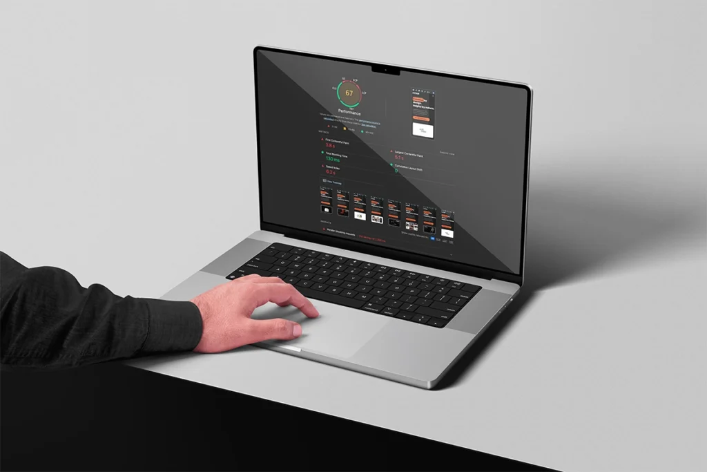
A free website audit gives you a clear picture of how your site is performing and where you can make easy improvements. Done by a human and not AI.
Useful Tools for Checking Website User Experience
You don’t need an expensive collection of software to start reviewing website UX.
- Google PageSpeed Insights: Check performance and Core Web Vitals information.
- Google Analytics: Explore traffic and how visitors move between pages, provided it is configured correctly.
- Microsoft Clarity or Hotjar: Review heatmaps and session recordings, with the appropriate privacy and consent setup.
- Google Search Console: Find pages and queries bringing people to the website and review Core Web Vitals reports.
- WAVE: Identify potential accessibility issues that need further review.
- Browser developer tools: Preview different screen sizes and inspect technical problems.
- A notebook: Record what happens during a simple user test. It does not need to be complicated.
Automated tools can point you towards possible issues, but they cannot fully decide whether the journey makes sense to a customer. Use them alongside human testing.
Final Thoughts
Good website UX is not about adding more features or following every design trend. It is about removing confusion and helping people achieve what they came to do.
Start with one important journey. Use the website as a customer would, identify the points that create friction and make the clearest improvement first. Then test it again.
Those changes may appear small, but together they can create a website that feels easier to use, represents the business more professionally and gives potential customers greater confidence to take the next step.
If your website looks the part but is not working as well as it should, take a look at our web design services or get in touch. We can help you work out what is getting in the way and what needs improving.