
Your logo might appear on a shop sign one day and in a tiny social media profile picture the next. It needs to feel right for your business, make sense to your customers and work wherever you use it.
That is a lot to ask from one design.
It is also why choosing a font, adding an icon and hoping for the best rarely produces a strong result. Good logo design starts with your business and ends with plenty of testing.
These practical logo design tips for small businesses will help you make clearer decisions, whether you are creating your first logo, reviewing an early idea or preparing to brief a professional designer.
- What Makes a Good Logo?
- 1. Start With the Business, Not the Design Software
- 2. Research Your Competitors Without Copying Them
- 3. Choose the Right Type of Logo
- 4. Keep It Simple, but Not Generic
- 5. Make Typography Part of the Idea
- 6. Choose Colours in Context
- 7. Design a Flexible Logo System
- 8. Test It Where Customers Will See It
- 9. Make Sure the Name and Strapline Stay Legible
- 10. Check That the Idea Is Distinctive and Usable
- 11. Ask for Useful Feedback
- 12. Get the Right Files and Simple Guidelines
- Common Small Business Logo Design Mistakes
- Should You Design a Logo Yourself or Hire a Designer?
- Small Business Logo Checklist
- Build a Logo You Can Use With Confidence
- FAQs
What Makes a Good Logo?
A good logo is distinctive, appropriate for the business and easy to recognise. It should remain clear at different sizes, work in colour or one colour, and feel consistent with the wider brand.
It does not need to explain everything you sell. Its main job is to identify your business and help people recognise it again.
The strongest logos usually share a few qualities. They are:
- Relevant to the business and its audience
- Distinctive enough to avoid blending in
- Simple enough to recognise quickly
- Legible at the sizes where they will be used
- Flexible across digital and printed materials
- Supported by clear colours, fonts and usage rules
With those principles in mind, here is how to put them into practice.
1. Start With the Business, Not the Design Software
Before you open Canva, Illustrator or a logo generator, decide what the logo needs to represent.
Write down:
- What your business does
- Who you most want to reach
- What makes you different from similar businesses
- How you want customers to describe you
- Where the logo will appear most often
Try choosing three words that should guide the design, such as “warm, practical and modern” or “established, precise and dependable”. These words give you a useful test later. If an idea looks attractive but feels playful when the business needs to feel dependable, it is probably the wrong direction.
This does not need to become an enormous branding exercise. However, a little clarity at the beginning prevents endless debates about personal taste. If you need help defining the bigger picture, start with our guide to brand strategy for small businesses.
2. Research Your Competitors Without Copying Them
Place the logos of ten or fifteen relevant competitors on one page. Look for repeated colours, fonts, shapes and symbols.
The aim is not to choose the most popular idea. It is to understand the visual conventions in your sector and find room to be recognisable.
For example, if every local building company uses the same roof shape, adding another roof is unlikely to make your business memorable. You might stand out through a distinctive wordmark, an unexpected but appropriate colour or a symbol connected to your particular way of working.
Relevance matters, but so does distinction. Your logo should feel as though it belongs in your market without looking interchangeable with everyone else in it.
3. Choose the Right Type of Logo
Not every business needs an icon. In fact, a clear wordmark that focuses on the company name can be a strong choice for a new business because it helps people learn the name.
Other common options include:
Wordmark: The business name styled in a distinctive way
Lettermark: Initials used when the full name is long
Combination mark: A name and symbol designed to work together
Emblem: Wording contained within a badge or crest
Symbol: A standalone visual mark, usually most effective once a brand is already well known
For many small businesses, a wordmark or combination mark offers the most flexibility. You can keep the name visible while developing a recognisable visual element.
Our guide to the different types of logos explains the strengths and limitations of each option in more detail.
4. Keep It Simple, but Not Generic
A logo has very little time to do its job. Too many shapes, colours, words or effects make it difficult to recognise and even harder to reproduce.
Simplicity helps, but “simple” does not mean choosing the first plain icon and font you find. A generic design may be tidy yet still be forgettable.
Aim to remove anything that does not add meaning or make the logo more distinctive. Ask:
- Does the logo still work without the strapline?
- Is every shape necessary?
- Can I describe the main idea in one sentence?
- Would the silhouette still be recognisable?
- Does it resemble a common template or stock icon?
Be especially careful with fine lines, tiny wording, shadows and detailed illustrations. They may look impressive on a large screen but disappear on a business card or social profile.
5. Make Typography Part of the Idea
The font is not simply a label added after the symbol. Its shape, spacing and weight influence the whole personality of the logo.
A serif typeface may feel established or editorial. A clean sans serif can feel direct and modern. A script can feel personal, but it may become difficult to read when it is small. These are useful starting points rather than fixed rules; the details of the individual typeface matter more than the category alone.
When reviewing typography:
- Check that the business name is easy to read at a glance.
- Pay attention to spacing between letters.
- Avoid several competing font styles.
- Test unusual letter combinations in your business name.
- Make sure the font licence covers commercial use.
- Do not rely on a thin weight that disappears in print.
You can find more practical typography advice in our guide to choosing the right font.
6. Choose Colours in Context
Colour can help create the right impression, but it is rarely as simple as “blue means trust” or “red means energy”. Meaning changes with the shade, the combination, the industry and the audience.
Begin with the personality you defined earlier. Then look at how the palette works in real situations, including your website, signage, packaging or uniforms.
A practical logo palette normally needs:
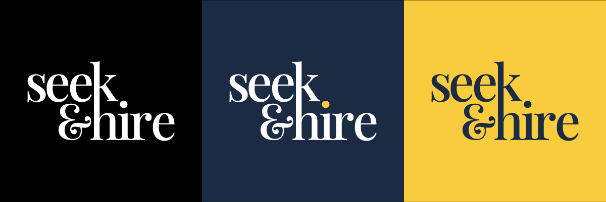
- A primary colour version.
- A black version.
- A white or reversed version for dark backgrounds.
- Defined colour values for screen and print.
Do not rely on colour to rescue a weak design. Your logo should still be clear and recognisable in one colour. This is important for invoices, stamps, embroidery, photocopies and any situation where full colour is unavailable.
For a deeper look at building a suitable palette, read our guide to colour psychology in design.
7. Design a Flexible Logo System
One logo layout will not fit every space. A wide version might work perfectly in a website header but become unreadable in a square profile picture.
Instead of forcing one file into every setting, create a small family of related versions:
- A primary logo
- A horizontal or stacked alternative
- A simplified mark for small spaces
- Full-colour, black and white versions
- Versions for light and dark backgrounds
Each version should feel like the same brand. The symbol, typography, colour and spacing should remain consistent even when the arrangement changes.
This is sometimes called a responsive logo system. For a small business, it does not need to be complicated. It simply gives you the right version for the space instead of encouraging people to squash, crop or rebuild the logo themselves.
8. Test It Where Customers Will See It
A logo is not finished because it looks good in the centre of a presentation. Test it at realistic sizes and in realistic situations.
Depending on the business, that might include:
- A mobile website header
- A social media profile image
- A Google Business Profile image
- A business card
- An invoice or proposal
- A shop sign or vehicle graphic
- Workwear or embroidery
- Product packaging
- A one-colour print
View it on an actual phone rather than only shrinking it on a large monitor. Print it at business-card size. Place it on a light and dark background. Ask a printer or sign maker whether very fine details will reproduce reliably.
Real-world testing often reveals problems that are invisible in the design file.
9. Make Sure the Name and Strapline Stay Legible
A complicated logo may still look attractive when large, but customers need to be able to identify the business in the places that matter.
If your logo includes a strapline, decide whether it needs to appear in every version. In many cases, it can be removed at smaller sizes while the business name remains. Trying to preserve tiny secondary wording often weakens the entire design.
Check the contrast between the wording and its background, particularly when the logo sits on a photograph. Also avoid stretching the logo or placing it too close to other elements. A little protected space around it makes it easier to notice and read.
10. Check That the Idea Is Distinctive and Usable
Before you commit to a logo, check that it is not uncomfortably close to another business, particularly one operating in the same field.
A web search, image search and competitor review can uncover obvious similarities. You should also search the UK Intellectual Property Office trade mark database if you plan to build the business around the name or symbol.
These checks are useful starting points, not a substitute for professional legal advice or a formal clearance search. If the brand will carry significant commercial value, sell internationally or enter a crowded category, speak to a qualified trade mark professional.
Also confirm that you have the right to use every element commercially. This includes typefaces, stock icons and template assets. “Free to download” does not always mean “free to use in a business logo”.
11. Ask for Useful Feedback
Showing the logo to other people can reveal issues you have stopped noticing. However, asking “Do you like it?” usually produces opinions rather than useful evidence.
Instead, show the design briefly and ask:
- What type of business do you think this is?
- Which three words would you use to describe it?
- What did you notice first?
- Is the name easy to read?
- Does anything feel confusing or familiar?
- Which version would you remember tomorrow, and why?
Where possible, include people who resemble your intended customers. Look for patterns across several responses instead of changing the design after every individual comment.
Feedback should inform the decision, not turn the process into a vote. The final choice still needs to meet the brief you created at the beginning.
12. Get the Right Files and Simple Guidelines

A logo is only useful if you have files that work when you need them. A screenshot or small JPEG is not enough.
Ask your designer for a clearly organised package that includes:
- SVG: A scalable vector format suited to websites and many digital uses.
- PDF or EPS: A vector format commonly useful for professional printing and signage.
- PNG: A raster file with a transparent background for everyday digital use.
- JPG: A convenient format for situations where transparency is not needed.
- Editable source file: The original working artwork, where this is included in your agreement.
You should receive the approved logo variations, colour versions and basic guidance explaining which file to use. A simple brand guide can also record:
- Colour values.
- Font names and licences.
- Minimum size.
- Clear space around the logo.
- Approved versions.
- Examples of changes to avoid.
This prevents future suppliers, employees or collaborators from guessing how the logo should appear.
Common Small Business Logo Design Mistakes
Even a promising idea can be weakened by the way it is developed or used. Watch out for these common mistakes:
- Starting with a fashionable style instead of a clear brief.
- Copying the visual habits of every competitor.
- Trying to explain every service in one symbol.
- Using too many colours, fonts or effects.
- Adding a strapline that becomes unreadable at small sizes.
- Choosing a stock icon that other businesses can also use.
- Approving the design before testing it in real situations.
- Relying on one low-resolution file.
- Allowing everyone to stretch, recolour or rearrange the logo.
- Redesigning repeatedly because personal tastes have changed.
If an existing logo no longer represents the business, you may not need to start from scratch. Our guide to when to update your logo explains the difference between a careful refresh, a redesign and a wider rebrand.
Should You Design a Logo Yourself or Hire a Designer?
A DIY logo can be a sensible temporary solution when you are testing an idea, working with a very small budget or creating an internal project. A straightforward wordmark is often safer than a complicated template because it is easier to read and use consistently.
Before using a logo maker or AI tool, check:
- Whether the output can be used commercially.
- Whether the symbol is exclusive to you.
- Whether editable vector files are included.
- Whether you can create all the versions you need.
- Whether the design is suitable for trade mark registration.
If the business is ready to invest in signage, packaging, a new website or a larger launch, professional input can prevent expensive changes later. A designer can turn the business strategy into a distinctive idea, refine the details and prepare a practical set of files.
If you are still deciding what to handle yourself, our guide to DIY branding on a budget will help you prioritise. You can also read about the potential limitations of AI logo design.
Small Business Logo Checklist
Before you approve your logo, ask:
- Does it reflect the business and appeal to the intended audience?
- Is it different from the logos used by close competitors?
- Can people read the name quickly?
- Does it still work in black or white?
- Is it clear in a small social media image?
- Does it work on both light and dark backgrounds?
- Have you tested it on your real marketing materials?
- Do you have horizontal, stacked and simplified versions where needed?
- Have you checked fonts, icons and other assets for commercial use?
- Have you completed basic similarity and trade mark checks?
- Do you have vector, print and transparent-background files?
- Are the colours, fonts and usage rules documented?
If you cannot answer yes to every question, the design may need another round of refinement.
Build a Logo You Can Use With Confidence
A good small business logo is not the design with the most detail or the cleverest hidden meaning. It is the one that feels appropriate, stands apart from competitors and works reliably wherever customers encounter it.
Start with a clear understanding of the business. Keep the idea focused. Test it in real situations, check the rights and make sure you receive the correct files. Those decisions will matter long after a particular design trend has passed.
If you would like help turning your ideas into a distinctive, flexible identity, explore our logo design service. Every project begins with understanding your business, your audience and what you want people to remember.