Your logo is often one of the first things people notice about your business. It appears on your website, social media profiles, signage, proposals, uniforms, packaging and almost every other piece of marketing you create.
However, the logo you chose when you first started your business might not work as well today.
Perhaps your business has grown, your services have changed, or you’re trying to reach a different type of customer. Or, your logo might look a little dated next to your competitors.
That doesn’t always mean you need to throw everything away and start again. Sometimes, a few considered changes can make your logo clearer, more flexible and more representative of the business you’ve become.
So, how do you know when to update your logo? In this guide, we’ll explore seven common signs that it could be time for a refresh, along with the difference between updating your logo and completing a full rebrand.
- Does Every Logo Eventually Need Updating?
- Logo Refresh, Logo Redesign Or Full Rebrand?
- 1. Your Logo Looks Dated
- 2. Your Business Has Changed
- 3. Your Logo Doesn’t Work Well Online
- 4. You Don’t Have The Right Logo Files
- 5. Your Logo Is Too Complicated
- 6. Your Branding Is Inconsistent
- 7. You Feel Embarrassed To Use It
- How Often Should You Update Your Logo?
- Should You Keep Parts Of Your Existing Logo?
- Can You Update A Logo Yourself?
- What Should Happen During A Logo Refresh?
- Is It Time To Refresh Your Logo?
- Need A Fresh Pair Of Eyes On Your Logo?
Does Every Logo Eventually Need Updating?
Not necessarily.
A well-designed logo can remain effective for many years. Some businesses have used the same core symbol, colours or lettering for decades. While small details may have changed over time, the recognisable parts of the logo have remained intact.

The aim isn’t to chase every new design trend. Constantly changing your logo can make it harder for customers to recognise your business and weaken the familiarity you’ve already built.
Instead, you should consider whether your current logo still does its job.
A good business logo should:
- Feel relevant to your business and audience.
- Be easy to recognise.
- Remain clear at different sizes.
- Work across digital and printed materials.
- Reflect the quality of your products or services.
- Give you confidence when you use it.
If your logo still ticks those boxes, there might be no need to change it. However, if several of them start to feel questionable, it could be worth taking a closer look.
Logo Refresh, Logo Redesign Or Full Rebrand?
Before deciding what to change, it helps to understand the difference between a logo refresh, a logo redesign and a full rebrand.
Logo Refresh
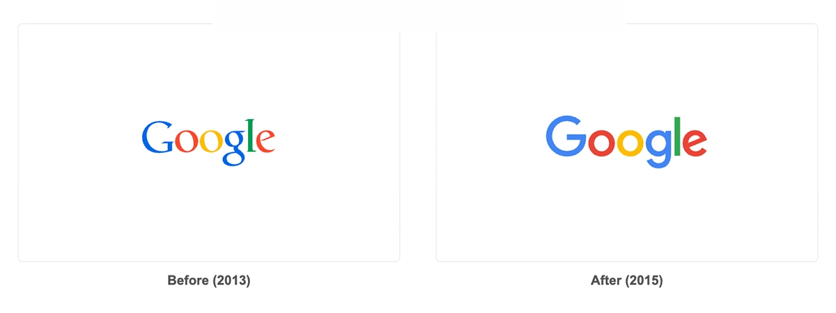
A logo refresh makes relatively small improvements while retaining the main identity of your existing design.
This might involve:
- Simplifying an icon
- Updating the typeface
- Adjusting the spacing
- Refining the colour palette
- Removing an outdated effect
- Creating a clearer version for small screens
A refresh works well when people already recognise your logo, but the design needs polishing or modernising.
Logo Redesign
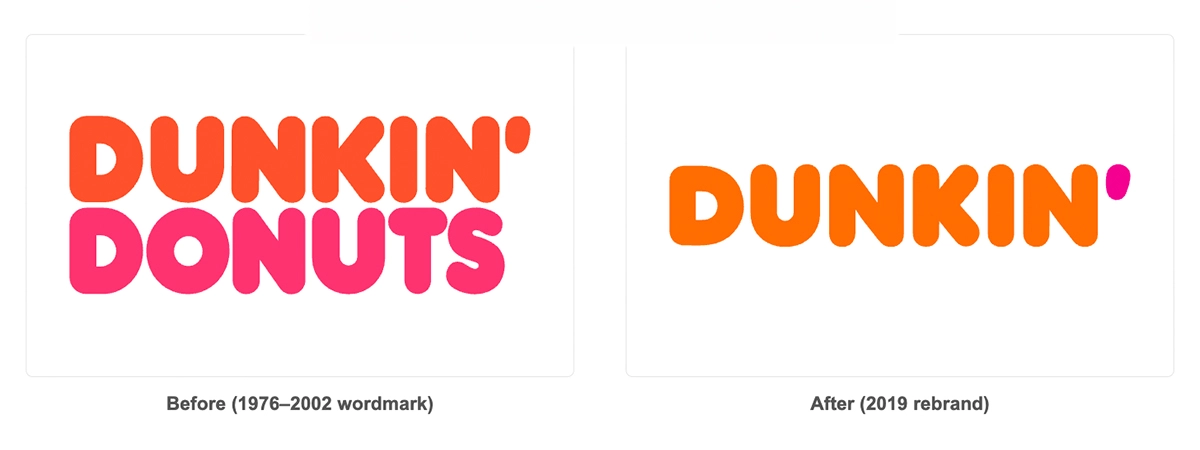
A redesign involves making more significant changes to the logo. You may keep one or two familiar elements, such as a colour or symbol, but the final design could look noticeably different.
This may be the right approach if the current logo has technical problems, doesn’t reflect the business or feels too similar to a competitor.
Full Rebrand
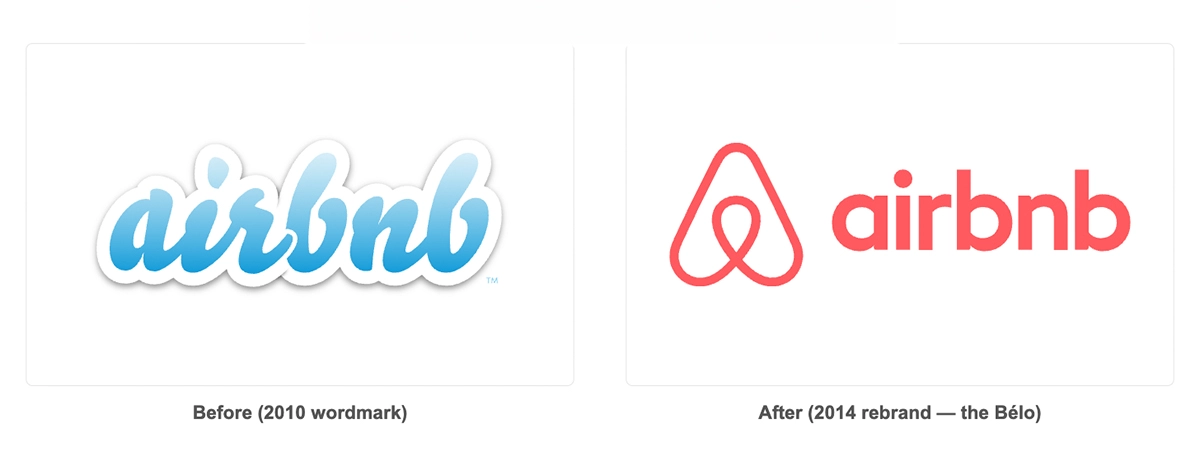
A full rebrand goes beyond the logo. It can include your colours, fonts, tone of voice, photography, messaging and overall positioning.
You might need a full rebrand if your business has changed considerably or if you want to alter how customers perceive it. However, if the main problem is an awkward or dated logo, a complete rebrand might be unnecessary.
Good branding should feel considered and purposeful. If you’re unsure which approach you need, our branding services for small businesses can help you work out the most sensible next step.
1. Your Logo Looks Dated
The clearest sign that it might be time to update your logo is that it looks noticeably dated.
Design styles change. Fonts, colour combinations and visual effects that looked modern 15 years ago can now make a business feel behind the times. Common examples include excessive gradients, complicated shadows, shiny effects and highly detailed icons.
Of course, there’s a difference between dated and traditional. A long-established solicitor, heritage business or country pub may deliberately use a classic style. That doesn’t automatically mean its logo needs modernising.
The real question is whether the design still creates the right impression.
Compare your logo with those of other well-presented businesses in your sector. Does yours still feel professional and relevant, or does it look as though it belongs to a different era?
Your logo doesn’t need to follow every passing trend. In fact, highly trendy designs often age quickly. Instead, aim for something simple, distinctive and appropriate for your business.
A thoughtful refresh can remove dated elements without losing everything customers already recognise.
2. Your Business Has Changed
Many small businesses start with a simple logo created quickly and on a limited budget. At that point, the priority is often getting up and running rather than building a complete visual identity.
However, businesses rarely stand still.
You may have expanded your services, entered a new market or changed the type of customer you want to attract. You might also have grown from a one-person startup into an established team.
If your business has changed but your logo hasn’t, there can be a noticeable disconnect.
For example, imagine a tradesperson who created a logo focused on one specific service. Several years later, the business offers a much wider range of commercial and domestic work. The original logo may now make the company appear more limited than it actually is.
Similarly, a logo created for a small side project may not reflect the credibility of a business that now employs several people and works with larger clients.
When considering when to update your logo, ask yourself:
- Does the logo still reflect what we offer?
- Does it appeal to the customers we want today?
- Does it communicate the right level of quality?
- Does it match the size and ambition of the business?
- Would we choose the same design if we started today?
If the answers are mostly no, your business may have outgrown its logo.
3. Your Logo Doesn’t Work Well Online
A logo that looked fine on a shop sign or business card may not work particularly well on modern digital platforms.
Today, your logo needs to appear clearly in many different places. These can include:
- Website headers
- Mobile menus
- Social media profile images
- Email signatures
- Online adverts
- Google Business Profiles
- Video content
- Favicons and browser tabs
Each of these spaces has a different shape and size. A long, detailed logo might fit across the top of a letterhead but become almost unreadable inside a small social media circle.
Likewise, a logo with thin text or intricate details can disappear when viewed on a mobile phone.
One of the easiest ways to test your logo is to shrink it down. Can you still read the business name? Can you identify the symbol? Does it become a blurry collection of lines?
You should also test it on both light and dark backgrounds. If your logo only works on white, you may struggle to use it consistently across your marketing.
A modern logo system often includes several variations, such as:
- A primary horizontal logo
- A stacked version
- An icon or brand mark
- A one-colour version
- A reversed version for dark backgrounds
You don’t need to display every element of your logo in every situation. Having flexible variations allows you to keep the brand recognisable while choosing the right version for each space.
4. You Don’t Have The Right Logo Files
Do you have the original files for your logo, or are you relying on a small JPEG saved from an old email?
This is a surprisingly common problem for small businesses.
A low-resolution image might look acceptable in an email signature, but it can become blurry or pixelated when you use it on a sign, van, banner or printed brochure. You may also find that your logo has a white box around it because you don’t have a version with a transparent background.
Ideally, you should have your logo in several formats, including:
- SVG for websites and scalable digital use
- EPS or AI for professional design and printing
- PNG with a transparent background
- JPEG for simple everyday use
- PDF for sharing and printing
Vector files, such as SVG, EPS and AI, can be enlarged without losing quality. This makes them particularly important for signage, clothing, vehicle graphics and large-format printing.
However, recreating a poor-quality image as a vector won’t necessarily fix a weak design. If you only have a tiny or outdated logo file, it may be a good opportunity to review the logo itself before paying someone to redraw it.
At the very least, you should come away from the process with an organised set of files and clear guidance on which version to use.
5. Your Logo Is Too Complicated
A logo doesn’t need to explain every part of your business.
In an attempt to show exactly what they do, small businesses sometimes include several symbols, multiple colours, a long tagline and a detailed illustration within one design. Although each element may have a reason for being there, the finished logo can become difficult to understand.
Complicated logos also create practical problems. Fine details disappear at small sizes, long taglines become unreadable and multiple colours make printing more difficult.
Simplicity doesn’t mean making your logo boring. It means removing anything that isn’t helping.
Think about what someone needs to recognise and remember. This could be a distinctive wordmark, a strong symbol, or a combination of the two.
If you covered the business name, would the icon still be clear? If you removed the tagline, would the logo become easier to read? Could you reproduce it effectively in one colour?
These questions can help identify whether the design has become overloaded.
If you’re considering a different approach, our guide to the different types of logos explains the advantages of wordmarks, symbols, combination marks and other common styles.
6. Your Branding Is Inconsistent
Perhaps you have several versions of your logo, but nobody knows which one is correct.
Your website might use one shade of blue, your social media pages another, and your latest leaflet a completely different version. Over time, people may have stretched the logo, changed the font or added effects to make it fit a particular design.
This inconsistency can make an otherwise professional business feel disorganised.
It also makes everyday marketing harder. Each time you create a social post, proposal or flyer, you have to make new decisions about colours, fonts and logo placement.
Updating your logo allows you to bring everything back together.
However, the logo file alone won’t solve the problem. You’ll also benefit from having some basic brand guidelines that explain:
- Which logo version to use
- Your approved colours and colour codes
- Your chosen fonts
- How much space to leave around the logo
- Which backgrounds it can appear on
- How the logo shouldn’t be altered
These guidelines don’t need to fill a hundred-page document. For many small businesses, a concise and practical guide is enough to create consistency.
Once everyone uses the same assets, your marketing starts to feel more connected. Customers see the same visual identity on your website, social media, emails and printed materials, which makes your business easier to recognise.
7. You Feel Embarrassed To Use It
This might not sound like a technical design problem, but it matters.
If you avoid putting your logo on proposals, feel uncomfortable sharing your business card or find yourself apologising for the design, it probably isn’t representing your business properly.
Your branding should give you confidence.
That doesn’t mean you need to love every tiny detail forever. Business owners naturally become accustomed to their branding and may occasionally want something new. However, there’s a difference between feeling bored with a familiar logo and genuinely feeling that it lets the business down.
Try to understand what’s causing the discomfort.
Is it because the logo looks amateurish? Does it feel too playful or too corporate? Is it difficult to read? Does it remind you of an earlier version of the business that no longer exists?
You can also ask a small number of trusted customers or colleagues for honest feedback. Avoid asking everyone you know to vote on their favourite design, as branding decisions shouldn’t become a popularity contest. Instead, ask focused questions such as:
- What type of business does this logo make you think of?
- What three words would you use to describe it?
- Does it feel professional and trustworthy?
- Is the business name easy to read?
- Is there anything confusing about it?
Look for repeated themes in the answers. One personal preference doesn’t necessarily indicate a problem, but consistent feedback can highlight issues you may have missed.
How Often Should You Update Your Logo?
There’s no fixed rule for how often a business should update its logo.
You shouldn’t redesign it every couple of years simply because you fancy a change. Brand recognition takes time to build, and frequent redesigns can make your business feel inconsistent.
Instead, review your logo when something meaningful changes. This could include:
- Launching a new website
- Expanding into a different market
- Changing your business name
- Introducing new services
- Targeting a different audience
- Merging with another business
- Opening a new location
- Updating the wider brand
It’s also sensible to complete a general branding review every few years. That doesn’t mean you must make changes. It simply gives you a chance to check whether your logo still works across every part of the business.
When deciding when to update your logo, focus on function and relevance rather than age alone. A ten-year-old logo that remains clear and appropriate may work better than a two-year-old design that was poorly considered from the start.
Should You Keep Parts Of Your Existing Logo?
In many cases, yes.
If your business has built recognition around a particular colour, symbol or typeface, keeping part of that identity can make the transition easier for existing customers.
A refresh might retain the familiar shape of an icon while simplifying the details. Alternatively, it could keep your established colours but introduce clearer typography and improved spacing.
Before making changes, identify what already works.
Ask yourself:
- Which parts do customers recognise?
- Is there a meaningful story behind the design?
- Are any colours strongly associated with the business?
- Does the logo have local or historical significance?
- Which elements still feel relevant?
You don’t need to protect every detail simply because it has always been there. However, you also shouldn’t remove recognisable elements without understanding their value.
The strongest refreshes usually balance familiarity with improvement. Existing customers can still recognise the business, while new customers receive a clearer and more professional first impression.
Can You Update A Logo Yourself?
If you’re running a startup with a limited budget, making a few simple improvements yourself can be tempting.
Tools such as Canva can help you create social media graphics or test different layouts. However, editing the logo itself requires more care.
Changing a font or colour may seem straightforward, but a logo needs to work as a complete system. Spacing, balance, readability, scalability and originality all affect the final result.
Template-based tools can also produce logos that look similar to those used by other businesses. That makes it more difficult to create something distinctive and may cause problems if the same icon appears elsewhere.
If you can’t invest in a full branding project yet, keep things simple. A clear business name in a well-chosen typeface will often work better than a complicated template filled with generic icons and effects.
When the business is ready, a professional designer can help you build on the strongest parts of what you already have.
Our guide to what makes a good logo covers the core principles in more detail.
What Should Happen During A Logo Refresh?
A professional logo refresh shouldn’t begin with someone immediately opening design software.
First, the designer should understand your business. They need to know what you offer, who you want to reach and how you want people to perceive you.
A typical process may include:
- Reviewing your existing logo and brand materials
- Discussing your business, customers and plans
- Identifying what should stay and what needs improving
- Exploring suitable creative directions
- Developing and refining the strongest concept
- Testing the logo across realistic situations
- Preparing the final logo variations and file formats
- Creating practical brand guidelines
You should understand the thinking behind the design rather than simply receiving something that “looks nice”.
Each choice should have a purpose. The colours, typography, shapes and layout should support the impression you want the business to create.
Is It Time To Refresh Your Logo?
Knowing when to update your logo isn’t about following the latest trend or changing it simply because it has reached a certain age.
It’s about recognising when the design no longer supports the business.
Your logo may need attention if it looks dated, doesn’t reflect what you offer, becomes unreadable online, or makes your marketing feel inconsistent. Likewise, if you don’t have usable files or you’ve simply outgrown the original design, a refresh can make a meaningful difference.
However, updating your logo doesn’t have to mean abandoning everything you’ve built. A considered refresh can preserve the parts people already recognise while making the design clearer, more flexible and better suited to the future of your business.
Most importantly, your logo should feel like it belongs to you. It should represent your business accurately, work wherever you need it and give you confidence whenever you put it in front of a customer.
If your current logo isn’t quite doing that anymore, it might be time to give it another look.
Need A Fresh Pair Of Eyes On Your Logo?
Not sure whether your logo needs a few refinements or a complete rethink?
We help small businesses and startups create purposeful branding that feels genuine, works across digital and print, and gives them something they’re proud to use.
Take a look at our branding services or tell us about your project, and we’ll help you work out the right next step.