
When more than half of your visitors are browsing on mobile, a website not responsive isn’t just an inconvenience, it’s a conversion killer.
A single responsive issue can make a page impossible to read, break your layout, push your call-to-action off-screen, or cause visitors to leave before the page even loads.
The good news? Most responsive problems follow predictable patterns, and once you understand them, they’re surprisingly easy to fix.
In this guide, we’ll walk through the 10 most common reasons a website is not responsive, why they happen, and exactly how to put them right. Whether you’re updating your own website or auditing a client project, these fixes will help you create a site that looks clean, loads fast and adapts beautifully to every device.
- 1. Fixed Width Layouts
- 2. Unoptimised Images
- 3. Missing the Viewport Meta Tag
- 4. Inconsistent Font Sizes
- 5. Overcomplicated Navigation
- 6. Content Overflow
- 7. Ignoring Touchscreen Interactions
- 8. Inconsistent Spacing & Alignment
- 9. Only Testing in a Desktop Browser
- 10. Not Prioritising Content
- How to Test Whether Your Website Is Responsive
- Why Website Responsiveness Is So Important
- When to Consider a Full Responsive Redesign
- Final Thoughts
- your free website audit
1. Fixed Width Layouts
The Issue
A fixed-width container, for example, width: 960px, doesn’t adapt to smaller screens. This is one of the most common reasons a website is not responsive, because it forces users to horizontally scroll or zoom out to view content.
Why It Matters
Modern layouts must stretch or shrink fluidly. If a layout is rigid, it will always break on mobile.
How To Fix It
Use flexible units (%, flex, grid) instead of fixed pixel widths:
css
.container {
     width: 100%;
     max-width: 1200px;
     margin: 0 auto;
}
Quick Win
Open Chrome DevTools → Responsive Mode → inspect any element that looks too wide. If you see a fixed pixel value, that’s your culprit.
2. Unoptimised Images
The Issue
Large, unscaled images push layouts out of alignment, making the entire page appear not responsive.
Why It Happens
- Images are larger than the container
- No
srcsetfor responsive loading - No
max-width: 100%rule
How To Fix It
Use responsive images:
html
<img src="image-small.jpg"
     srcset="image-medium.jpg 768w, image-large.jpg 1200w"
     alt="">
Use responsive CSS:
css
img {
  width: 100%;
  height: auto;
}
Quick Win
Run Lighthouse → “Serve scaled images” audit. Fix everything in that list.
3. Missing the Viewport Meta Tag
The Issue
Without the viewport meta tag, mobile browsers treat your site like a tiny desktop screen. This makes all pages zoomed out and unreadable.
How To Fix It
Add this to your <head>:
html
<meta name="viewport" content="width=device-width, initial-scale=1">Quick Win
If your mobile layout looks “miniature”, this is almost always the cause.
4. Inconsistent Font Sizes
The Issue
Fixed pixel font sizes don’t scale, which means text can appear too large, too small, or misaligned on different devices.
Why it makes a website feel not responsive
If the typography doesn’t adjust, the layout never feels balanced on mobile.
How to fix it
Use relative units like `em` or `rem` instead of pixels for font sizes to ensure they scale appropriately.
css
body { font-size: 1rem; }
h1 { font-size: 2.5rem; }
5. Overcomplicated Navigation
The Issue
Mega menus, too many links, or navigation items that shrink instead of stacking can easily turn into a website not responsive issue.
How To Fix It
Introduce a mobile-first approach:
- A clean hamburger menu
- Clear spacing
- Accessible tap targets
- Simple menus (no 4-level dropdowns)
html
<nav>
     <button class="menu-toggle">Menu</button>
       <ul class="menu">
          <li><a href="#home">Home</a></li>
          <li><a href="#services">Services</a></li>
          <li><a href="#contact">Contact</a></li>
       </ul>
</nav>
css
.menu {
  display: none;
}
.menu-toggle {
  display: block;
}
@media (min-width: 768px) {
  .menu {
    display: flex;
  }
  .menu-toggle {
    display: none;
  }
}
Quick Win
If your navigation takes more than one line on mobile → simplify it.
6. Content Overflow
The Issue
Overflowing tables, code blocks, images or long URLs push the whole layout sideways.
How To Fix It
Force elements to stay within the viewport:
css
.content {
  width: 100%;
  overflow-x: auto;
}
@media (min-width: 600px) {
  .content {
    width: 80%;
  }
}
Quick Win
If you see a horizontal scrollbar, even a tiny one, something is overflowing.
7. Ignoring Touchscreen Interactions
The Issue
Buttons or links that are too small to tap lead to usability problems and make the site feel unresponsive.
How To Fix It
Clear separation between elements
Minimum 44px tap targets
Extra spacing
css
button, a {
  padding: 1rem;
  margin: 0.5rem;
}
Quick Win
Try using your thumb to navigate your website. If anything feels fiddly, increase the size.
8. Inconsistent Spacing & Alignment
The Issue
When spacing is created with fixed margins or padding, layouts collapse awkwardly on small screens.
How To Fix It
Use flexible spacing with Flexbox or Grid:
css
.container {
  display: flex;
  flex-wrap: wrap;
  gap: 1rem;
}
.item {
  flex: 1 1 calc(50% - 1rem);
}
@media (min-width: 768px) {
  .item {
    flex: 1 1 calc(33.333% - 1rem);
  }
}
Quick Win
Check spacing at three breakpoints: desktop, tablet, mobile. If any feel cramped or too loose, adjust your layout rules.

9. Only Testing in a Desktop Browser
The Issue
Dragging your browser window narrower does not replicate how a real phone behaves. As a result, many people miss the true reasons their website is not responsive.
How To Fix It
Test on:
- Real phones
- Real tablets
- Device simulators (BrowserStack, Responsively App)
- Chrome responsive mode
Quick Win
Always test on at least one real iPhone and one Android device.
10. Not Prioritising Content
The Issue
If everything is given equal importance, a layout becomes messy on mobile. This is a big contributor to websites not being responsive in practice.
How To Fix It
Use progressive enhancement:
- Use collapsible sections
- Show essential content first
- Move or hide secondary blocks
css
@media (max-width: 600px) {
  .secondary-content {
    display: none;
  }
}
Quick Win
Ask: “What does a mobile user need to know first?” Put that content at the top.
How to Test Whether Your Website Is Responsive
A lot of people only check on their own phone, but that won’t show the full picture. Here are the quickest and most reliable ways to test your site and spot the issues that might be making your website not responsive.
1. Use Your Browser’s Responsive Mode (Chrome, Safari, Firefox)
Every major browser now includes a built-in responsive testing tool.
In Chrome:
- Right-click anywhere → Inspect → Toggle Device Toolbar
- Select device presets (iPhone 14, Galaxy S20, iPad, etc.)
- Resize the screen and watch how the layout adapts
2. Test on Real Devices (Essential)
Responsive mode is helpful, but it’s not perfect. Real devices behave differently because of:
- Physical pixel density
- Touch behaviour
- Keyboard interactions
- Viewport height differences (especially iPhones)
Test on at least:
- One iPhone
- One Android phone
- One iPad or tablet
If something looks “off”, it usually means the layout still needs work.
3. Use Online Responsive Testing Tools
These tools allow you to view your website on multiple devices side-by-side, making it extremely easy to spot why your website is not responsive in certain breakpoints.
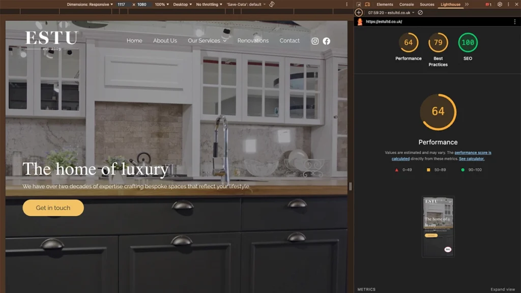
4. Run a Lighthouse Audit
Chrome DevTools → Lighthouse → Generate Report
Look for:
- “Does not use responsive images”
- “Tap targets not sized correctly”
- “Content wider than screen”
Lighthouse will literally highlight the exact blocks causing issues.
5. Validate Your Layout With CSS Debug Tools
Useful techniques include:
- Adding temporary outlines to all elements
- Checking for large fixed widths
- Using Grid/Flexbox inspectors
Example CSS debugging snippet:
* {
  outline: 1px dashed rgba(0,0,0,0.1);
}
Great for identifying areas where spacing collapses or elements overflow.
Why Website Responsiveness Is So Important
Many businesses underestimate just how important responsive design is today. It’s not simply about “fitting on a phone”, it directly affects user experience, SEO, conversions and even trust. If your website is not responsive, visitors will leave within seconds.
Here’s why responsiveness matters more than ever:
1. Mobile Traffic Dominates
Google’s global data shows that 64% of all searches come from mobile devices.
In certain industries, it’s even higher.
Most small business websites see:
- 55%–75% of traffic from mobile
- Desktop usage continuing to decline
- Tablets making up 5–10% of the remainder
This means: If your website is not responsive, you’re effectively losing the majority of your visitors.
Even a small responsive issue, like cramped text or a broken menu, can dramatically reduce conversions on mobile.
2. Google Uses Mobile-First Indexing
Google no longer looks at your desktop layout first. It uses the mobile version of your website to:
- Determine rankings
- Understand your content
- Assess site quality
- Crawl structure and links
So if the mobile version is broken, missing content, or badly formatted, your SEO performance suffers, even on desktop.
3. Visitors Judge Your Business by Mobile Experience
Research shows:
- 88% of users won’t return to a site after a bad mobile experience
- 53% abandon a page if it takes longer than 3 seconds to load
- Mobile-friendly websites convert up to 2–3× better
Responsive issues aren’t just technical problems, they directly affect trust and buying decisions.
4. Social Traffic → Mobile Traffic
Traffic from:
- TikTok
- YouTube Shorts
- LinkedIn mobile
…all lands on your website through mobile devices.
If visitors click a blog link and the website is not responsive, they leave instantly. Costing you traffic, engagement and leads.
When to Consider a Full Responsive Redesign
A few responsive errors are normal, but you may need a redesign if:
- The theme is outdated or fixed-width
- The website isn’t using modern Flexbox/Grid layouts
- You cannot change responsive settings without custom code
- CSS is overly complicated or full of !important overrides
- The layout breaks badly at multiple breakpoints
In these cases, small fixes won’t solve the root issue — a more modern build is needed.
Need a fully responsive website?
Check out our web design services
Final Thoughts
If your website is not responsive, it doesn’t mean you need a full rebuild. Most issues come down to:
- Fixed widths
- Overflowing content
- Unoptimised images
- Overcomplicated navigation
- Missing breakpoints
Small, targeted fixes can completely transform how your website feels on mobile, and your conversion rate will often improve almost immediately.
If you’d like a professional pair of eyes on your site, we offer a free website audit where we highlight responsive issues, UX problems and opportunities to improve your performance.