Your website is often the first impression people get of your business. And like it or not, users form opinions fast.
In fact, it takes just a few seconds for someone to decide whether they trust your brand or click away.
That’s why keeping your website up to date isn’t just about looking good. It’s about staying competitive, improving user experience, and ultimately driving more enquiries or sales.
In this post, we’ll break down some of the most common outdated web design trends that are still floating around and, more importantly, what you should be doing instead.
- Why Outdated Web Design Matters
- 1. Cluttered Layouts with Too Much Going On
- 2. Sliders and Carousels on the Homepage
- 3. Auto-Playing Videos and Music
- 4. Non-Mobile-Friendly Design
- 5. Stock Photos That Feel Fake
- 6. Overuse of Animations and Effects
- 7. Long, Dense Blocks of Text
- 8. Hidden Navigation and Confusing Menus
- 9. Slow Loading Speeds
- 10. Outdated Fonts and Poor Typography
- 11. Too Many Calls to Action
- 12. Ignoring Accessibility
- 13. No Clear Brand Identity
- 14. Outdated Content and Information
- 15. Designing for Yourself, Not Your Users
- How to Know If Your Website Needs an Update
- Final Thoughts
Why Outdated Web Design Matters
Before we get into the trends, let’s quickly address the bigger picture.
An outdated website can:
- Make your business look unprofessional
- Reduce trust and credibility
- Hurt your SEO performance
- Increase bounce rates
- Lower conversions
Even if your services are excellent, a poor website can quietly hold your business back.
The good news? Most of these issues are easy to fix once you know what to look for.
1. Cluttered Layouts with Too Much Going On
There was a time when more meant better. More text, images, and buttons.
Now? It just overwhelms people.
Why it’s outdated:
Users don’t want to work hard to understand your website. If they feel confused or overloaded, they’ll leave.
What to do instead:
Keep things simple and focused.
- Use clear sections
- Add plenty of spacing
- Highlight one main action per section
A clean layout helps guide users exactly where you want them to go.
2. Sliders and Carousels on the Homepage
Sliders used to be everywhere. Big rotating banners showing multiple messages.
But here’s the reality…
Most people don’t wait for slides to change.
Why it’s outdated:
- Users ignore them (banner blindness)
- They slow down your website
- They dilute your main message
What to do instead:
Use a strong, single hero section.
- Clear headline
- Supporting message
- One call to action
Simple, direct, effective.
Need help updating your curent website?
Check out our web design services
3. Auto-Playing Videos and Music
We’ve all experienced it. You land on a website and suddenly… sound starts playing.
Instant panic.
Why it’s outdated:
- Annoys users
- Feels intrusive
- Can cause people to leave immediately
What to do instead:
If you’re using video (which is great), give users control.
- Let them choose to play
- Keep it short and relevant
- Use it to support your message, not distract from it
4. Non-Mobile-Friendly Design
This one isn’t just outdated. It’s critical.
If your website doesn’t work properly on mobile, you’re losing a huge portion of your audience.
Why it’s outdated:
Most traffic now comes from mobile devices. A poor mobile experience kills engagement.
What to do instead:
Make sure your website is fully responsive.
- Text should be easy to read
- Buttons should be easy to tap
- Layouts should adapt properly
If you have to zoom in to use your site, it needs fixing.
5. Stock Photos That Feel Fake

Generic stock images used to be the norm. Smiling office workers, staged handshakes, overly polished scenes.
Now they just feel… fake.
Why it’s outdated:
People can spot stock imagery instantly. It reduces authenticity and trust.
What to do instead:
Use real visuals wherever possible.
- Photos of your team
- Your workspace
- Your actual products or services
If you do use stock, choose more natural, less staged images.
6. Overuse of Animations and Effects
Animations can be great when used well. But too many?
That’s where things go wrong.
Why it’s outdated:
- Slows down your site
- Distracts from your content
- Can feel gimmicky
What to do instead:
Use subtle, purposeful animation.
- Small hover effects
- Smooth transitions
- Light motion to guide attention
Less is definitely more here.
7. Long, Dense Blocks of Text
No one wants to read a wall of text.
Even if your content is valuable, poor formatting makes it hard to engage with.
Why it’s outdated:
People skim online. If your content isn’t easy to scan, it won’t get read.
What to do instead:
Break things up.
- Use headings and subheadings
- Add bullet points
- Keep paragraphs short
Make your content easy to digest.
8. Hidden Navigation and Confusing Menus
Some websites try to be clever with navigation. Hidden menus, unusual layouts, creative structures.
It might look cool… but it often creates confusion.
Why it’s outdated:
Users expect familiar navigation. If they can’t find what they need quickly, they’ll leave.
What to do instead:
Keep navigation simple and predictable.
- Clear menu structure
- Logical page names
- Easy access to key pages
Don’t reinvent the wheel here.
9. Slow Loading Speeds
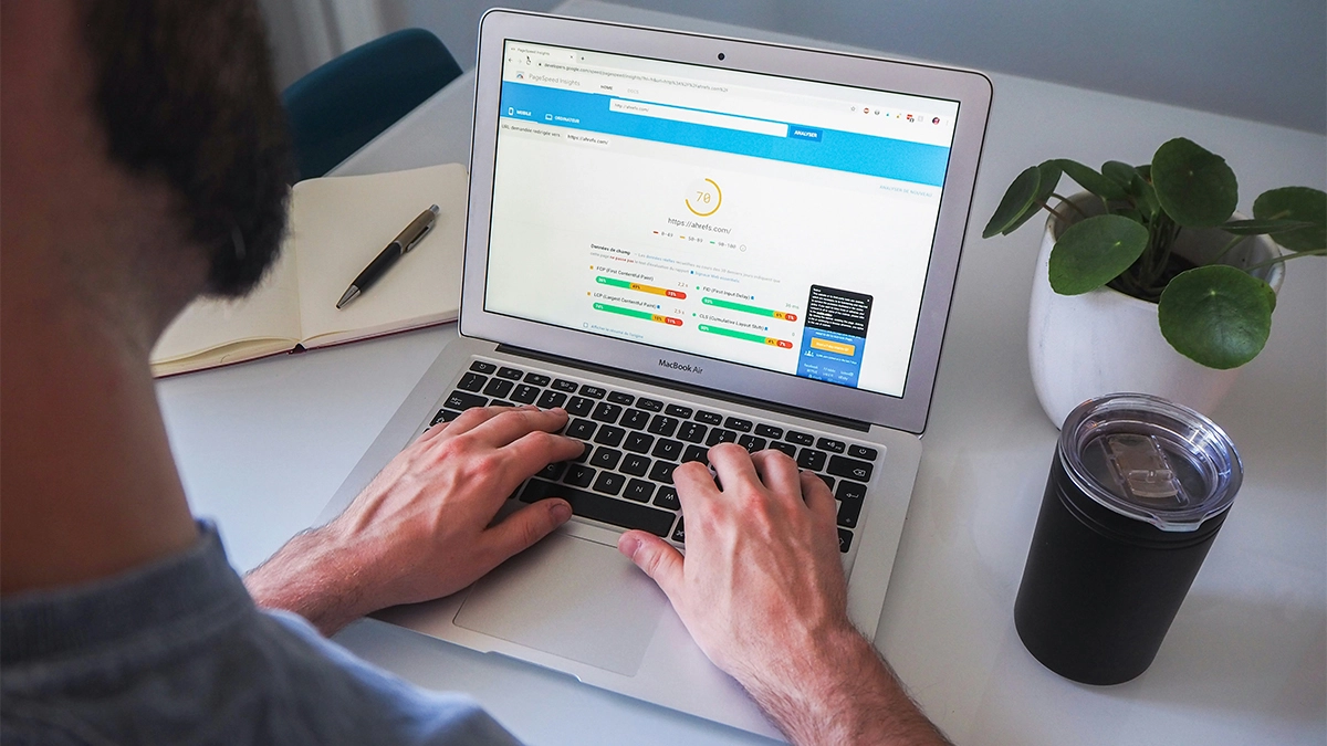
Speed isn’t just a technical detail. It’s a user experience issue.
Why it’s outdated:
People expect fast websites. If yours takes too long to load, they won’t wait.
What to do instead:
Optimise performance.
- Compress images
- Use proper hosting
- Minimise unnecessary scripts
A faster website = better experience + better SEO.
10. Outdated Fonts and Poor Typography
Fonts play a bigger role than most people realise.
Old-fashioned or hard-to-read typography can make your site feel dated instantly.
Why it’s outdated:
- Reduces readability
- Impacts overall design quality
- Makes your brand feel behind the times
What to do instead:
Use modern, clean fonts.
- Keep it consistent
- Ensure good contrast
- Prioritise readability
Your content should be effortless to read.
11. Too Many Calls to Action
“Contact us”, “Get a quote”, “Learn more”, “Download now”…
All on the same screen.
Why it’s outdated:
Too many options create decision fatigue. Users don’t know what to do next.
What to do instead:
Focus on one primary goal per page or section.
- Guide users clearly
- Reduce distractions
- Make the next step obvious
Clarity always wins.
12. Ignoring Accessibility
Accessibility is often overlooked, but it’s becoming more important than ever.
Why it’s outdated:
Websites that aren’t accessible exclude users and can damage your brand.
What to do instead:
Make your site usable for everyone.
- Use readable font sizes
- Ensure colour contrast
- Add alt text to images
Better accessibility improves usability for all users, not just some.
13. No Clear Brand Identity
Some websites feel like they could belong to anyone.
No personality, clear message, or differentiation.
Why it’s outdated:
In a competitive market, blending in is a problem.
What to do instead:
Make your brand stand out.
- Use consistent colours and fonts
- Define your tone of voice
- Clearly communicate what makes you different
Your website should feel like you.
Need help updating your curent website?
Check out our web design services
14. Outdated Content and Information
Even if your design looks okay, outdated content can let you down.
Why it’s outdated:
Old information creates doubt. People start questioning whether your business is still active.
What to do instead:
Keep your website fresh.
- Update services and pricing
- Refresh images
- Add new content regularly
A maintained website builds trust.
15. Designing for Yourself, Not Your Users
This might be the biggest one.
Many businesses design their website based on what they like, not what their audience needs.
Why it’s outdated:
Your opinion isn’t the one that matters. Your users decide whether your site works.
What to do instead:
Focus on user experience.
- Think about what your customers want
- Make information easy to find
- Guide them towards taking action
Good design is about solving problems, not just looking good.
How to Know If Your Website Needs an Update
If you’re unsure whether your site is outdated, ask yourself:
- Does it look modern compared to competitors?
- Is it easy to use on mobile?
- Does it load quickly?
- Is the messaging clear?
- Are you getting consistent enquiries or sales?
If the answer to several of these is “no”, it’s probably time for a refresh.
Final Thoughts
Web design trends change, but the fundamentals stay the same.
Your website should:
- Be easy to use
- Look professional
- Communicate clearly
- Guide users towards action
If your site is still using outdated web design trends, it could be quietly costing you leads and sales.
The good news is that small improvements can make a big difference, and if you’re not sure where to start, that’s exactly where we come in.
Need Help Updating Your Current Website?
If your website feels dated, slow, awkward to use or no longer reflects your business properly, it might be time for a refresh.
At 404 Marketing, we build custom WordPress websites that are clean, practical and easy to manage. We work with businesses looking for web design in Newark and web design in Lincoln, helping them move away from tired layouts and towards websites that feel clearer, faster and more professional.
Get in touch and let’s chat about updating your site.