When you’re building a brand from scratch, one of the biggest decisions you’ll make is choosing the right type of logo. Your logo isn’t just a pretty graphic. It communicates your personality, builds trust and helps people instantly recognise your business wherever they see it.
Yet with so many logo styles out there, it’s easy to feel overwhelmed or unsure about what will work best.
This guide breaks down the different types of logos, explaining how each one works, what they’re best suited for, and how small businesses can make confident branding decisions without needing a design degree. Whether you’re launching a new venture or refreshing your existing brand, understanding these logo styles will help you invest in something that truly represents you.
- Why Your Logo Style Matters
- 1. Wordmark Logos (Logotypes)
- 2. Lettermark Logos (Monograms)
- 3. Symbol Logos (Brand Marks)
- 4. Combination Mark Logos
- 5. Emblem Logos
- 6. Mascot Logos
- 7. Abstract Logos
- 8. Letterform Logos
- 9. Dynamic Logos
- Which Type of Logo is right for you?
- How to Choose Colours, Fonts and Style
- Why Professional Logo Design Is Worth the Investment
- Final Thoughts
Why Your Logo Style Matters
Before we dive in, it’s worth highlighting why logo style matters. Your logo:
- Creates a first impression that sticks
- Helps customers recognise your brand instantly
- Signals your professionalism and credibility
- Works across your marketing, website, social media and packaging
- Sets the tone for your visual identity
Choosing the wrong style can make your brand feel outdated, unclear or simply unmemorable. On the other hand, choosing the right one builds trust before you’ve said a word.
Now, let’s look at the different types of logos and how to choose the right one for your business.
1. Wordmark Logos (Logotypes)
A wordmark logo is made up entirely of your business name. There are no icons, shapes or symbols – just clean, confident typography.
Well-known examples include Google, Coca-Cola, and LinkedIn.
Why wordmarks work
Wordmarks are powerful for new businesses because they help people learn and remember your name. When the typography is done well, your brand feels professional and instantly recognisable.
Best for:
- Startups with short or unique business names
- Service-based businesses that want a clean, modern look
- Brands that want their name to become the “icon”
Things to consider
You need strong typography. A generic font won’t stand out, so a designer will usually customise a typeface to give it personality. Wordmarks also need flexibility, because they should still look clear at small sizes, like social media icons or website headers.
2. Lettermark Logos (Monograms)
A lettermark logo uses initials rather than the full business name. Think BBC, IBM, or HP.
Why lettermarks work
They simplify long names. If your business name feels too lengthy to use in full, a set of initials can offer a cleaner, more compact visual identity.
Best for:
- Businesses with long names
- Professional services like accountants, agencies or consultants
- Brands that want a timeless, simple design
Things to consider
Because lettermarks shorten your name, you’ll need consistent branding elsewhere (like your website and marketing materials) to make sure customers still remember the full name.
3. Symbol Logos (Brand Marks)
A symbol logo uses an icon or graphic – no words. Famous examples include Apple, Twitter (X) and Nike.
Why symbol logos work
Brand marks are visually striking and extremely memorable. They work beautifully on product packaging, signage and digital assets.
Best for:
- Established brands that already have strong name recognition
- Businesses wanting a bold, minimalist identity
- Product-focused companies
Things to consider
Small businesses rarely start with a symbol-only logo. Without a name, customers might not recognise who you are. Many brands start with a combination logo (word + symbol) and transition to a symbol once they’re well known.
Looking for a professional logo?
Check out our branding services
4. Combination Mark Logos
A combination mark uses both a symbol and text together. This is one of the most popular logo styles for small businesses because it gives you the best of both worlds.
Examples include Adidas, Burger King, and Dropbox.
Why combination marks work
You gain flexibility. You can use the full logo on your website, and then use just the icon for social media or product packaging.
Best for:
- New businesses that need both recognition and personality
- Brands wanting a strong symbol but still needing their name visible
- Companies that want a future-proof logo
Things to consider
Combination logos should work in both stacked and horizontal formats to give you freedom across different platforms.
5. Emblem Logos
An emblem logo features text inside a badge, icon, or crest. Think Starbucks, Harley-Davidson, or many sports teams.
Why emblems work
They feel traditional, trustworthy and established. Ideal for brands that want to communicate heritage or craftsmanship.
Best for:
- Food and drink brands
- Craft businesses
- Schools, clubs and organisations
- Businesses wanting a classic look
Things to consider
Emblems can become difficult to read at small sizes, especially when there’s a lot of detail. A designer may need to create simplified versions for digital use.
6. Mascot Logos
Mascot logos use illustrated characters, such as animals, people or fictional figures, to represent the brand. Think KFC’s Colonel Sanders or Mr Pringles.
Why mascots work
They create an emotional connection. People remember characters, which makes mascots ideal for fun, friendly and approachable brands.
Best for:
- Family-focused businesses
- Food brands
- Entertainment companies
- Brands aiming for a playful personality
Things to consider
Mascots need consistent illustration styles across all marketing materials. They also may not suit more formal industries like law, finance or consultancy.
Looking for a professional logo?
Check out our branding services
7. Abstract Logos
Abstract logos use unique shapes or geometric designs that don’t represent anything literal. Examples include Pepsi, BP, and Airbnb.
Why abstract marks work
They allow complete creative freedom. Instead of being tied to literal imagery, you can communicate feeling and identity through shape and colour.
Best for:
- Modern, innovative businesses
- Brands wanting a unique identity
- Startups looking to stand out in crowded markets
Things to consider
Abstract logos still need meaning behind them. Without a strategy, they can appear random or confusing. Work with a designer who ensures your shapes and colours have purpose.
8. Letterform Logos
A letterform logo uses a single letter, which is often the first letter of the business name, styled in a distinctive way. Examples include McDonald’s “M”, WordPress “W”, and Unilever “U”.
Why letterform logos work
They’re extremely versatile and recognisable. They also work brilliantly as app icons, favicons and social media profile pictures.
Best for:
- Brands with strong name recognition
- Companies wanting a bold, simple mark
- Businesses that want a flexible, scalable identity
Things to consider
As with monograms, you need clear branding elsewhere so customers can connect the symbol back to your name.
9. Dynamic Logos
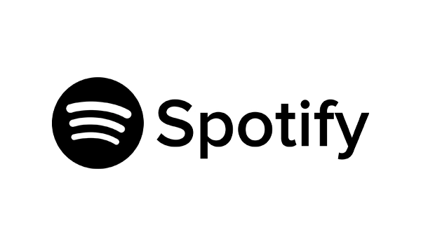
A dynamic or responsive logo adapts across different platforms. The design elements stay consistent, but the layout changes. For example, Spotify, Google, and many modern tech brands use simplified versions for mobile.
Why dynamic logos work
They give you flexibility, especially when your brand appears on lots of platforms with different space restrictions.
Best for:
- Digital-first businesses
- Brands using both long-form and small-space logos
- Companies wanting a modern, tech-forward identity
Things to consider
Dynamic logos require a clear brand system so every format still feels connected and recognisable.
Looking for a professional logo?
Check out our branding services
Which Type of Logo is right for you?
Choosing the right logo depends on your goals, industry, and personality. Here’s a quick guide to help you decide:
- Wordmark = You want your name front and centre, and your brand is new.
- Lettermark = Your business name is long and needs simplifying.
- Combination mark = You want flexibility and a balance between symbol and text – this is the safest option for most small businesses.
- Symbol or abstract mark = You want something iconic and minimalist, and you’re ready to build strong brand recognition over time.
- Emblem = You want a traditional or handcrafted look.
- Mascot = Your brand is fun, friendly and aimed at families.
- Letterform = You want a bold, simple visual for future recognition.
How to Choose Colours, Fonts and Style
Once you’ve picked the type of logo, the next step is building a complete visual identity.
1. Colours
Colours create emotion. Blue feels trustworthy, red feels energetic, green feels natural. Make sure your chosen palette reflects the personality of your brand.
2. Fonts
Typography influences how people perceive your business. Serif fonts feel traditional, sans-serif fonts feel modern, and script fonts feel creative or elegant.
3. Simplicity
Your logo should work in black and white, look clear at small sizes, and remain recognisable immediately.
4. Versatility
Make sure you have versions for:
- Dark backgrounds
- Light backgrounds
- Social media
- Website headers
- Print materials
Why Professional Logo Design Is Worth the Investment
DIY tools can create simple logos, but they can’t provide strategy, and strategy is what makes a logo meaningful.
A professional designer can help you by:
- Understanding your target audience
- Choosing the right style
- Creating scalable versions
- Building a cohesive colour and font system
- Ensuring your logo works across digital and print
Investing in brand identity early on helps you avoid costly rebranding later.
Final Thoughts
Your logo is the heart of your brand identity. By understanding the different types of logos, you can make smarter decisions about how you want to represent your business. Whether you choose a simple wordmark or a bold combination mark, the most important thing is that your logo feels authentic, memorable and aligned with your brand values.
If you’re looking for help choosing the right direction or want a bespoke logo designed for your business, 404 Marketing can support you with a friendly, hands-on approach tailored to small businesses and startups.