If your website is getting traffic but not generating enquiries, there’s a good chance your call to actions are the problem.
This is one of the most common issues we see with small business websites. The design looks good. The content is decent. But there’s no clear direction for the user.
In simple terms, people don’t know what to do next.
That’s where clear call-to-action examples come in. When done properly, they guide your visitors, remove friction, and turn passive browsers into actual leads or customers.
In this guide, we’ll break down what makes a good call to action, show you practical examples you can use, and explain how to improve your own website without overcomplicating things.
What Is a Call to Action (CTA)?
A call to action is exactly what it sounds like. It tells your visitor what action to take next.
That action could be:
- Getting in touch
- Booking a service
- Downloading something
- Making a purchase
Most commonly, it appears as a button or short line of text.
For example:
- Get a Quote
- Book a Call
- Download the Guide
- Start Your Free Trial
However, not all CTAs are created equal. A vague or poorly placed CTA can easily be ignored, even if the rest of your website is strong.=
Why Clear Call to Actions Matter
People don’t spend much time thinking when they browse websites. They scan. They skim. They make quick decisions.
Because of this, your CTA needs to do the thinking for them.
A clear call to action:
- Reduces confusion
- Speeds up decision-making
- Increases conversions
- Improves user experience
On the other hand, unclear CTAs lead to hesitation. And hesitation usually means people leave.
If your website says “Learn More” everywhere, you’re not giving users a reason to click. You’re just adding another step.
What Makes a Call to Action “Clear”?
Before we jump into clear call-to-action examples, it’s important to understand what actually makes a CTA effective.
1. It’s Specific
Generic CTAs don’t perform well because they lack meaning.
Instead of:
- Submit
Try:
- Get My Free Quote
The second option tells the user exactly what they’re getting.
2. It Focuses on the Benefit
People don’t click buttons for the sake of it. They click because they want a result.
For example:
- Download
vs
- Download Your Free Website Checklist
The second one highlights the value, not just the action.
3. It Creates Urgency (When Appropriate)
Not every CTA needs urgency, but it can help in the right context.
Examples:
- Book Your Slot Today
- Limited Spaces Available
- Start Now
Just avoid overdoing it. Fake urgency can feel pushy.
4. It Matches the Page Intent
Your CTA should align with where the user is in their journey.
For example:
- Blog post → Download a guide or read more
- Service page → Get a quote or book a call
- Product page → Buy now or add to basket
If the CTA doesn’t match the intent, it won’t convert.
5. It Stands Out Visually
Even the best wording won’t work if no one sees it.
Make sure your CTA:
- Uses contrasting colours
- Has enough spacing around it
- Is easy to tap on mobile
Clear Call to Action Examples You Can Use
1. Sign Up for Our Newsletter
Button Text:
“Join Our Community!”
Supporting Text:
“Subscribe to our newsletter to receive the latest updates, tips, and exclusive content straight to your inbox.”

Why It Works:
- Clear and Compelling:
The CTA clearly states what the user will get (latest updates, tips, exclusive content). - Action-Oriented:
Uses action verbs like “Join” and “Subscribe.” - Value Proposition:
Emphasises the benefits of subscribing.
2. Get Started for Free
Button Text:
“Start Your Free Trial”
Supporting Text:
“Experience all the features of our premium plan for 30 days, no credit card required.”
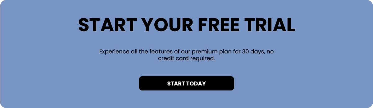
Why It Works:
- Low Barrier to Entry:
Offers a free trial with no immediate cost. - Action-Oriented:
Uses a strong action verb (“Start”). - Specific Benefit:
Highlights the trial period and lack of commitment required (no credit card needed).
3. Shop Now
Button Text:
“Shop Our Latest Collection”
Supporting Text:
“Discover the newest arrivals and find your perfect look.”

Why It Works:
- Immediate Action:
Encourages users to take immediate action to shop. - Clear and Direct:
Simple and straightforward command. - Appealing:
Uses enticing words like “latest” and “perfect.”
Need help creating a clear call-to-actions?
Check out our web design services
Where to Place Your CTAs
Even the best clear call to action examples won’t work if they’re in the wrong place.
Here’s where you should be including them:
1. Above the Fold
This is the first thing users see.
Make sure your main CTA is visible immediately without scrolling.
2. After Key Sections
As users scroll, they should be given multiple opportunities to take action.
For example:
- After explaining your service
- After showing testimonials
- After outlining benefits
3. At the End of Every Page
This is a big one that often gets missed.
If someone has read the whole page, they’re interested. Give them a clear next step.
4. In Your Navigation Bar
Having a CTA in your menu (like “Get a Quote”) keeps it accessible at all times.
Common CTA Mistakes to Avoid
Now that you’ve seen some clear call to action examples, it’s worth looking at what not to do.
Too Many Options
If you give users too many choices, they won’t choose anything.
Stick to one primary CTA per page.
Vague Language
Words like:
- Click Here
- Learn More
- Submit
Don’t give enough context.
Poor Placement
If users have to search for your CTA, they won’t find it.
Make it obvious.
No Value
If your CTA doesn’t explain what the user gets, it won’t convert.
Always highlight the benefit.
Ignoring Mobile Users
Buttons that are too small or hard to tap will cost you conversions.
Make sure everything works smoothly on mobile.
How to Improve Your Call to Actions (Quick Wins)
If you want to improve your website without a full redesign, start here:
- Rewrite Your Buttons:
Go through your site and replace generic CTAs with more specific ones. - Add More CTAs:
If you only have one at the bottom of the page, that’s not enough. Give users multiple chances to take action. - Focus on One Goal Per Page:
Each page should have a clear purpose.
Don’t mix “Buy Now”, “Subscribe”, and “Contact Us” all on the same page unless there’s a clear hierarchy. - Test Different Variations:
Small changes can make a big difference. Try: Different wording, colours and placements - Look at Your Analytics:
If people aren’t clicking, something isn’t working. Use tools like Google Analytics or heatmaps to understand behaviour.
Final Thoughts
Your website doesn’t need more traffic. It needs clearer direction.
That’s why focusing on clear call to action examples is one of the easiest and most effective ways to improve your conversions.
Start simple:
- Be specific
- Focus on the benefit
- Make it easy to click
- Place it where people will see it
You don’t need to overthink it. You just need to make it obvious what happens next.Clear Call to Action Examples: How to Get More Clicks and Conversions