Choosing the right font for your website might seem like a small detail – but it’s one of the biggest design decisions you’ll make. Your font shapes how people perceive your brand, how easily they can read your content, and even how long they stay on your website.
If you’re a small business owner or startup founder, you might not have a design team or brand consultant to guide you. The good news? You don’t need to be a designer to choose website font combinations that look professional, readable, and perfectly aligned with your brand personality.
In this guide, we’ll walk you through the basics of typography, the psychology behind fonts, and practical steps to test and choose the best fonts for your website.
- Why Typography Matters for Small-Business Websites
- Understanding Font Personality: Serif vs Sans-Serif
- Choosing Complementary Font Pairs
- Customising Your Chosen Fonts: Line Height and Letter Spacing
- Tools for Testing Fonts
- Common Font Mistakes to Avoid
- Font Licensing and Legal Considerations
- Accessibility Considerations
- Performance Impact of Fonts
- Troubleshooting Common Issues
- Examples from Real Websites
- Final Checklist for Choosing Your Font
- Bringing It All Together
Why Typography Matters for Small-Business Websites
Your website’s typography does more than just display text – it communicates tone, mood, and credibility.
Think of it like a handshake. The font you choose can either make your business look polished and trustworthy or outdated and difficult to read.
Fonts influence first impressions
Research shows that visitors form an opinion about a website in just 50 milliseconds. Fonts are one of the first visual elements they notice. A clean, modern typeface can instantly make your business look more professional and appealing.
Readability affects engagement
People skim online. They don’t read every word – they scan for key information. That’s why readable fonts with good spacing and contrast are crucial. Poor typography can frustrate visitors, increase bounce rates, and reduce conversions.
Consistency builds trust
When your fonts are consistent across headings, paragraphs, and buttons, your brand feels cohesive and intentional. This visual consistency reassures visitors that you pay attention to detail – and that your business can be trusted.
Understanding Font Personality: Serif vs Sans-Serif
Before you choose website font, it helps to understand the two main font families: serif and sans-serif. Each has its own personality and purpose.
Serif fonts: Traditional and trustworthy
Serif fonts have small decorative “feet” or lines at the ends of each letter. They’re often seen as classic, elegant, and reliable. Think of brands like The Times or Vogue.
They work well for professional industries like finance, law, or publishing – but they can also add sophistication to any website that wants to feel premium.
Examples: Times New Roman,
Georgia,
Merriweather.
Best for: Established, traditional, or luxury brands.
Sans-serif fonts: Modern and approachable
Sans-serif fonts are clean, simple, and easy to read on screens. They’re often perceived as modern, friendly, and minimalistic. Brands like Google and Spotify use sans-serif fonts to appear accessible and fresh.

Examples: Open Sans,
Lato,
Poppins,
Montserrat.
Best for: Startups, tech companies, creative industries, and modern small businesses.
Font personality in practice
If your business is bold and energetic, a strong sans-serif like Poppins or Montserrat could fit perfectly. If you’re aiming for elegance and trust – say, for a boutique law firm or consultancy – a serif font like Merriweather might be more suitable.
Your font should reflect your brand values as much as your logo or colour palette does.
Choosing Complementary Font Pairs
Most websites use two fonts: one for headings and one for body text. Pairing fonts creates visual hierarchy – it helps visitors know what’s important at a glance.
Here’s how to choose website font pairs that complement each other without clashing.
1. Contrast is key
Your heading font should stand out from your body font, but they should still feel like they belong together. If your body font is simple and neutral (like Open Sans), try a more characterful heading font (like Playfair Display).
PlayFair Display
Open Sans
2. Avoid using fonts that are too similar
Using two fonts that look almost the same can feel like a mistake rather than a choice. For example, Lato and Open Sans are both great fonts – but together, they’re too similar to create contrast.
Lato
Open Sans
3. Keep it simple
Two fonts are usually enough. One for headings, one for paragraphs.
Adding more can make your site look messy and inconsistent.
4. Try proven pairings
If you’re unsure where to start, these tried-and-tested combinations always work well:
| Elegant and modern | Playfair Display | Open Sans |
| Clean and minimal | Poppins | Roboto |
| Professional and creative | Lora | Montserrat |
| Friendly and approachable | Raleway | Lato |
These fonts are all free to use from Google Fonts, so you can experiment without worrying about licensing.
Customising Your Chosen Fonts: Line Height and Letter Spacing
Once you choose website font combinations that fit your brand, the next step is fine-tuning them. Small adjustments to line height and letter spacing (also known as leading and tracking in design terms) can transform your typography from “good enough” to “professionally polished.”
You don’t need to be a designer to do this – just a few tweaks in your website’s settings or CSS can make your text more readable and visually balanced.
1. Adjusting line height for readability
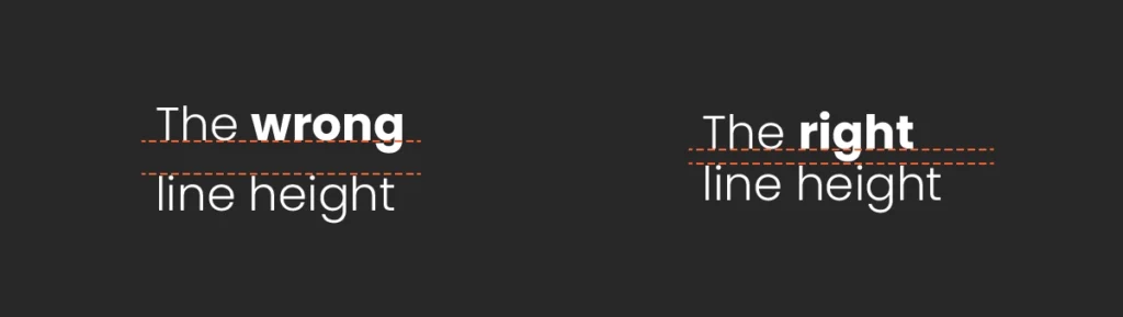
Line height is the vertical space between lines of text. Too tight, and your text looks cramped; too loose, and it feels disconnected.
As a general rule:
- For body text, aim for a line height between 1.4 and 1.6.
- For headings, go slightly tighter – around 1.2 to 1.3 – to keep your titles compact and bold.
Most website builders (like WordPress or Squarespace) let you adjust line height directly in the typography settings. If you’re using CSS, you can set it like this:
p {line-height: 1.6;}
Balanced line height improves readability and gives your site a clean, organised look – especially on mobile.
2. Fine-tuning letter spacing

Letter spacing (or tracking) controls how close each letter appears to the next. Small changes can dramatically alter the feel of your text.
- Increase spacing slightly for uppercase headings to make them easier to read.
- Reduce spacing a touch for large display fonts if they look too spread out.
Example CSS:
h1 {letter-spacing: 0.05em;}
This adds a little breathing room, helping letters look more elegant and balanced.
Avoid extreme changes – too much spacing can look unprofessional, while too little makes text dense and hard to scan.
3. Keep consistency across your site
Whatever adjustments you make, apply them consistently across headings, paragraphs, and buttons. Inconsistent spacing can make your site feel disjointed and unpolished.
A well-tuned type system helps your text “breathe” – improving both aesthetics and readability. It’s a small step that has a big impact on how professional your website feels.
Tools for Testing Fonts
The best way to choose website font combinations is to test them – not just in theory, but on your actual content.
Here are a few free tools that make it easy:
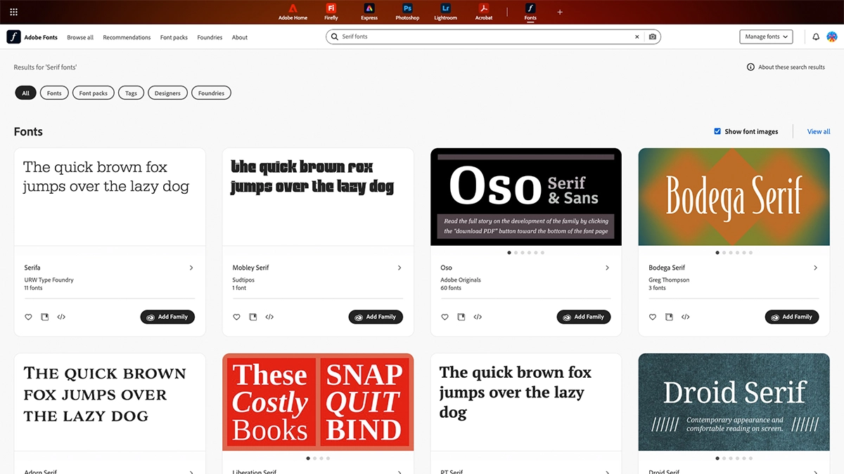
1. Google Fonts
Google Fonts is a designer’s best friend – and just as helpful for non-designers. You can browse hundreds of fonts, preview your own text, and even see popular pairings.
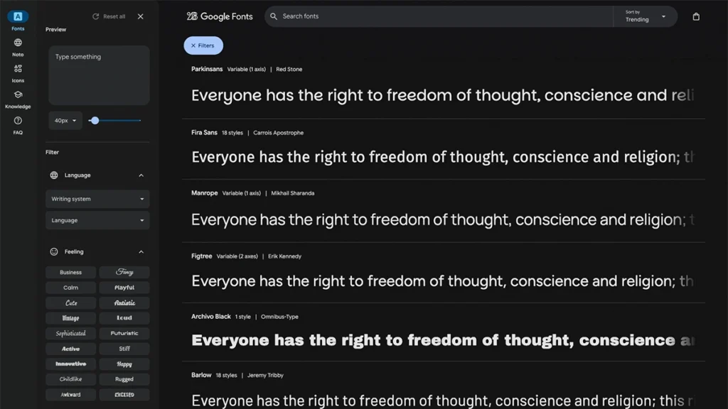
Tip: Use the “Pairings” tab under each font to see which combinations work well together.
2. Fontpair
Fontpair is a simple site that shows recommended Google Font pairings, sorted by style (e.g., “serif + sans-serif”). You can type your own heading and paragraph text to preview them instantly.
3. Figma
If you’re comfortable using design tools, Figma is brilliant for testing typography across layouts. You can import Google Fonts directly, adjust spacing, and visualise how your fonts look alongside your colours, images, and logo.
4. WhatFont browser extension
This Chrome or Safari extension lets you hover over any text on a website to see which font it uses. It’s a great way to get inspiration from sites you admire.
Common Font Mistakes to Avoid
Even the most stylish font can look wrong if it’s used poorly. Here are some of the most common mistakes small businesses make when choosing website fonts – and how to avoid them.
- Using too many fonts:
Using more than two fonts creates visual chaos. Stick to one font family (with different weights) or a simple heading/body combo. - Choosing trendy fonts that age badly:
Some fonts look great today but are outdated tomorrow. Avoid overly stylised display fonts – especially for body text. Stick with clean, timeless typefaces that won’t date your website in six months. - Ignoring readability:
Fancy script fonts might look beautiful on a wedding invitation, but they’re hard to read on screens. Always prioritise legibility, especially on mobile. - Poor line spacing and contrast:
Even a great font can look bad if it’s too cramped or lacks contrast against the background. Aim for 1.4–1.6 line height for body text and ensure dark text is used on light backgrounds (or vice versa). - Not testing across devices:
Fonts can render differently on Windows, Mac, and mobile. Before you finalise your choice, check how it looks across devices and browsers. - Forgetting your brand:
Your font should match your brand tone. A playful script might suit a cupcake shop but feel out of place for an accountant. Keep your audience and brand personality in mind.
Font Licensing and Legal Considerations
When you choose website font, it’s not just about design – it’s also about making sure you have the legal right to use it. Fonts are creative works, and just like images or logos, they’re protected by copyright.
Why licensing matters
If you use a font without the correct licence, you could face legal issues, takedown notices, or unexpected costs. Even if a font is free to download, it may not be licensed for commercial use (for example, on a business website).
Safe font sources
To stay compliant, always use reputable sources such as Google Fonts or Adobe Fonts, which offer fonts that are free for both personal and commercial projects. These are web-optimised and can be embedded safely without worrying about usage rights.
Self-hosting vs embedding
If you buy a premium font, check whether the licence allows web embedding. Some licences only cover print or desktop use. Always read the licence details before uploading font files to your website.
Being careful about licensing ensures your business looks professional and stays legally protected.
Accessibility Considerations
When you choose website font, accessibility should be a key factor – not just aesthetics. An accessible font helps more people use and enjoy your site, including those with visual impairments or dyslexia.
1. Choose dyslexia-friendly fonts
Avoid overly decorative or condensed typefaces. Fonts like Open Sans, Lato, or Verdana are clear, evenly spaced, and easier to read. Rounded letters and distinct shapes (such as a clear difference between “b” and “d”) make a big difference.
Good Dyslexia-Friendly Fonts
| Font | Why It’s Dyslexia-Friendly |
|---|---|
| Open Sans | Widely used and highly readable, with generous spacing and rounded shapes. |
| Lato | Balanced and friendly; clear distinction between similar letters. |
| Verdana | Designed for on-screen readability – wide letters, large x-height, and clear spacing. |
| Tahoma | Similar to Verdana but slightly narrower; still clear and easy to read. |
| Roboto | Modern and neutral, with good letter differentiation and spacing. |
| Dyslexie | A specialist typeface designed specifically for dyslexic readers (paid font). |
| Lexend | Scientifically designed to reduce visual stress and improve reading speed – available free via Google Fonts. |
Poor Dyslexia-Unfriendly Fonts
| Font | Why It’s Not Dyslexia-Friendly |
|---|---|
| Comic Sans MS | While it’s often recommended, many find it too informal and inconsistent for professional use – spacing can feel uneven. |
| Arial | Clean but too geometric; letters like “l”, “I”, and “1” look almost identical. |
| Helvetica | Similar to Arial – sleek but lacks clear distinction between similar letters. |
| Times New Roman | The small serifs and narrow spacing make it harder to track lines of text. |
| Courier New | Monospaced design makes letters look cramped and mechanical, slowing reading speed. |
| Script or Decorative Fonts | Anything cursive, condensed, or highly stylised should be avoided for body text – it’s tiring to read, especially on screens. |
2. Maintain sufficient contrast
The WCAG (Web Content Accessibility Guidelines) recommends a minimum contrast ratio of 4.5:1 between text and background. Use dark text on a light background or vice versa to make reading comfortable for everyone.
Poor Contrast
This text has a WCAG ratio of 2.95:1
Good Contrast
This text has a WCAG ratio of 7.12:1
3. Set readable sizes
Body text should generally be at least 16px, with headings clearly larger to create hierarchy. Small fonts may look sleek on desktop but can become unreadable on mobile.
Poor Example
This text is too small to read.
Good Example
This text is a good font-size of 16px.
4. Avoid all caps and long italics
Blocks of text in all capitals or italics can be harder to process, especially for users with reading difficulties. Use these styles sparingly and only for emphasis.
Prioritising accessibility not only improves user experience but can also boost your SEO and reflect positively on your brand’s inclusivity.
Example:
THIS IS THE SAME SENTENCE WRITTEN ALL IN CAPS. BLOCKS OF TEXT IN ALL CAPITALS OR ITALICS CAN BE HARDER TO PROCESS, ESPECIALLY FOR USERS WITH READING DIFFICULTIES. USE THESE STYLES SPARINGLY AND ONLY FOR EMPHASIS.
Example:
This is the same sentence written all in italics. Blocks of text in all capitals or italics can be harder to process, especially for users with reading difficulties. Use these styles sparingly and only for emphasis.
Performance Impact of Fonts
Fonts don’t just affect design – they also affect website speed. A slow-loading font can delay how quickly your site’s text appears, especially on mobile.
- Limit font weights and styles:
When you choose website font, avoid loading every weight (e.g., Light, Regular, Bold, Extra Bold). Stick to two or three that you actually use. This reduces file size and improves load times. - Optimise delivery:
If you’re using Google Fonts, select only the specific weights and character sets you need. For self-hosted fonts, use modern formats like WOFF2, which compress efficiently without losing quality. - Use font-display: swap:
Add the font-display: swap; property in your CSS. This ensures that your fallback font appears immediately, and your chosen font swaps in once it’s loaded – preventing the “invisible text” issue. - Consider system fonts:
If performance is critical, system fonts like Arial, Helvetica, or Segoe UI load instantly because they’re already installed on most devices. These can be a good choice for startups prioritising speed and simplicity.
Optimising your typography setup means your site looks great and loads fast – a win for both users and search engines.
Troubleshooting Common Issues
Even after you choose website font carefully, things can sometimes go wrong. Fonts may render differently across browsers, or fail to load altogether. Here’s how to handle common problems without getting too technical.
1. Check your fallback fonts
Always define a font stack in your CSS, such as:
font-family: 'Poppins', 'Helvetica Neue', Arial, sans-serif;
This ensures that if your main font fails to load, a similar fallback displays instead — keeping your layout intact.
2. Clear cache and CDN
If fonts don’t appear as expected after updates, clear your browser cache and any CDN (Content Delivery Network) caches. Cached font files can sometimes conflict with new versions.
3. Watch out for HTTPS issues
Fonts hosted on external servers (like Google Fonts) need to load securely over HTTPS. If your site is HTTPS but the font link isn’t, browsers may block it as “mixed content.”
4. Check for plugin or theme conflicts
In WordPress or other CMS platforms, some plugins or themes may override your font settings. Disable one at a time to identify the conflict if your chosen font isn’t displaying.
5. Test on multiple devices
Fonts can appear slightly different on Mac, Windows, or mobile devices due to rendering engines. Test across browsers (Chrome, Safari, Firefox, Edge) to ensure a consistent experience.
Troubleshooting font issues early keeps your site looking consistent and professional – even under the hood.
Examples from Real Websites
Let’s look at how a few small businesses get it right.
404 Marketing
Font: Poppins
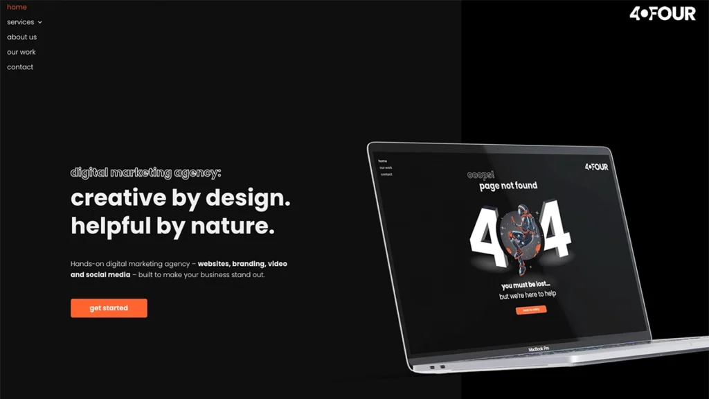
A modern sans-serif font that feels clean, creative, and approachable – perfectly aligned with our mission to help small businesses grow through bespoke digital marketing. Our typography stays consistent across the site, from headings to buttons, creating a unified look and feel.
As an added extra you may notice that we tend to use lower case for out headings (except our articles) to keep things fun and playful.
Acupunture Nottingham
Heading Font: IvyPresto Headline
Body Font: Helvetica

This website combines IvyPresto Headline for headings with Helvetica for body text. The contrast creates a sophisticated, premium feel that’s both timeless and calming – ideal for a wellness brand. The elegant serif headings add character and depth, while the clean sans-serif body font keeps everything readable and modern. Together, they reflect the site’s natural, relaxed atmosphere without losing professionalism.
Y-Notts
Heading Font: Blambot-pro
Body Font: Poppins

Y-Notts uses Blambot Pro for headings and Poppins for body text – a pairing that captures a youthful, energetic look. The bold, playful heading font draws attention and mirrors the vibrant brand colours, while Poppins keeps the content clear and approachable. It’s a great example of using modern typography to engage a younger audience while keeping the design cohesive and easy to read.
Each of these examples uses fonts strategically – not just for looks, but to reinforce brand identity and improve user experience.
Final Checklist for Choosing Your Font
Before you settle on your final choice, run through this quick checklist to make sure you’ve covered everything.
✅ Does it match your brand personality?
Does your font feel modern, elegant, playful, or professional – and does that match your business tone?
✅ Is it readable on all devices?
Check it on desktop, tablet, and mobile to make sure it looks clean and consistent.
✅ Have you limited your fonts to two or fewer?
One for headings, one for body text is usually enough.
✅ Do your fonts pair well together?
Make sure they contrast but don’t clash. Use a pairing tool if you’re unsure.
✅ Is your line spacing and contrast optimised?
Good readability is essential for user experience and SEO.
✅ Are the fonts easy to access?
Stick with web-safe or Google Fonts so your site loads quickly and displays correctly everywhere.
✅ Have you tested them with your actual content?
Preview your headlines, menus, and paragraphs to see how they look in real life – not just in mock-ups.
Bringing It All Together
Typography might seem like a design detail, but it’s one of the easiest ways to make your website feel professional, polished, and aligned with your brand.
When you choose website font combinations thoughtfully, you’re doing more than picking letters — you’re shaping how visitors experience your business online.
Start simple: choose two fonts that reflect your brand, test them across your pages, and make sure they’re readable everywhere. With a little care and consistency, you’ll have typography that looks like it was chosen by a designer — even if it wasn’t.