Every time someone visits your website, glances at your logo, or picks up a business card, they’re making instant judgements. Often, it’s colour that sets the tone. Your colour palette can make your brand feel trustworthy, exciting, calming, or even expensive – all before a single word is read.
For small businesses and startups, understanding colour psychology in design can help you create visuals that not only look good but also connect with your audience emotionally. In this guide, we’ll explain what colour psychology is, how it works, and how to use it effectively across your branding, website, and marketing materials.
If you’re just starting out with your visual identity, you might also want to read our post on What Makes a Good Logo – a great next step once you’ve nailed your colours.
What Is Colour Psychology?
Colour psychology studies how colours influence our perceptions, emotions, and behaviour. In design, it’s about choosing colours that help communicate your brand’s message clearly and memorably.
Think of it this way – if your brand were a person, colour is what they wear to make a first impression.
While colour preferences can be subjective, there are common associations backed by research and culture. These can guide you in building a palette that aligns with your business personality and audience expectations.
Common Colour Associations
| Red | Passion, urgency, energy | Sales, food, sport, entertainment |
| Blue | Trust, reliability, calm | Finance, tech, healthcare |
| Green | Growth, nature, wellbeing | Sustainability, wellness, finance |
| Yellow | Optimism, clarity, attention | Creative brands, retail highlights |
| Orange | Fun, enthusiasm, warmth | Fitness, events, youth-focused brands |
| Purple | Luxury, imagination, creativity | Beauty, design, premium products |
| Black | Sophistication, power, elegance | Luxury, high-end fashion, tech |
| White / Neutrals | Simplicity, cleanliness | Minimalist, wellness, tech brands |
- John Lewis uses muted greens and neutrals to create a sense of calm reliability.
- Innocent Drinks combine soft pastels and bright tones to reflect their friendly, natural image.
- Barclays and NatWest both rely on blue – one of the most trusted colours globally – to convey stability and professionalism.
Why Colour Psychology Matters for Small Businesses
Colour decisions might feel like a creative detail, but they impact how people feel about your brand- and feelings drive action. Here’s how colour influences design outcomes:
- First Impressions:
Studies show that up to 90% of first impressions are based on colour alone. A cohesive, thought-out colour scheme immediately signals credibility and consistency. - Emotional Connection:
Colours set emotional expectations. A gym using vibrant reds and oranges feels energetic; a wellness clinic using soft greens and whites feels calm and trustworthy. - Conversion & Behaviour:
Colour affects decision-making. For example, a clear, contrasting call-to-action button can increase clicks. - Accessibility & Usability:
Colour isn’t just visual – it affects readability and inclusivity. Make sure your designs meet contrast guidelines so your site works for everyone.
How to Use Colour Psychology Across Design Types
This section is where you can start thinking about colour in context. The principles stay the same, but the way you apply them changes depending on where your audience meets your brand.
1. Branding & Logos
Your logo sets the tone for your brand’s entire identity.
For example, a Nottingham café might use rich browns and creams to evoke warmth and comfort, while a tech startup in Manchester might prefer bold blues and clean whites for a sleek, modern look.
When designing your logo:
- Choose a primary colour that reflects your brand personality.
- Add 1–2 secondary colours for flexibility.
- Keep a neutral base (white, grey, black) for balance.
- Test your logo in black and white – it should still feel recognisable.
2. Website & Digital Design
On websites, colour directs attention and supports usability.
Follow the 60-30-10 rule:
- 60% dominant colour (background/base)
- 30% secondary colour (content areas)
- 10% accent (buttons, CTAs, highlights)
Example:
A small online shop could use a soft neutral palette for the layout (trust), with bright accent colours for “Add to Basket” or “Book Now” buttons to guide visitors toward action.
3. Print & Packaging
If you sell products in-store or through packaging, colour helps you stand out on the shelf. UK brands like Lush (bold black and white) and Cadbury (royal purple) have built entire identities around consistent colour use.
When printing:
- Always check colour consistency between screen (RGB) and print (CMYK).
- Use Pantone colours for precise brand reproduction.
- Test samples – some colours appear darker or duller on paper.
4. Social Media & Content Graphics
Consistency is key. Your social posts, reels, and stories should all feel “on brand.” Using your colour palette across templates, icons, and overlays builds familiarity and strengthens recognition.
If you’re creating branded social templates, consider how colour complements photography and video elements – especially for platforms like Instagram or LinkedIn where tone matters.
Ready to create a cohesive brand identity?
Check out our branding services
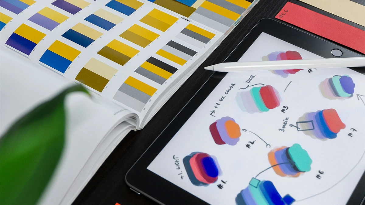
Step-by-Step: Building Your Colour Palette
Here’s a simple process to choose and apply colours effectively:
- Define Your Brand Personality
Write down how you want your business to feel: trustworthy, bold, modern, calm, premium, fun, etc. - Research Your Audience & Competitors
Note which colours your competitors use and where you can stand out. - Choose a Base Colour
Pick one main colour that reflects your brand values. - Add Supporting Colours
Choose complementary or contrasting tones for flexibility. - Create an Accent Colour
This is the one you’ll use for buttons, icons, and highlights. - Test in Context
Mock up your palette in a web design or flyer. Does it still feel right? - Check Accessibility
Use tools like WebAIM’s contrast checker to ensure readability. - Document Everything
Keep a mini brand style guide (with HEX and CMYK codes) to maintain consistency across all channels.
Common Mistakes to Avoid
- Too many colours: Stick to 3–5 maximum.
- Ignoring accessibility: Light grey text on white = unreadable.
- Following trends blindly: A pastel palette might look trendy today, but not fit your brand long-term.
- Cultural differences: If your audience is international, check colour meanings across cultures.
- Inconsistency: Don’t let your website, business cards, and social posts drift into different palettes.
Real UK Examples of Colour Done Right
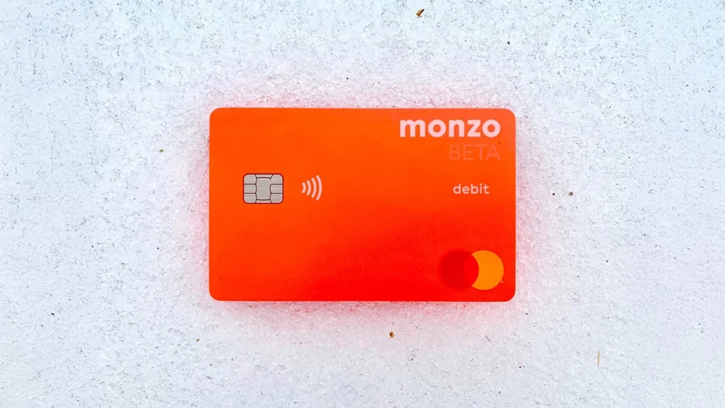
- Monzo Bank: Its bright coral debit card is instantly recognisable – a simple but bold move that reflects modern, energetic branding.
- Greggs: Uses deep blue and yellow for friendliness and trust – practical for a high-street staple.
- The Body Shop: Greens and neutrals that reflect nature and ethical values.
- Deliveroo: Teal branding that feels playful yet professional – matching its tone perfectly.
Each of these brands uses colour as an extension of their identity, not just decoration.
Final Thoughts
Colour is one of the most powerful design tools you have. When used well, it helps your small business:
- Build trust and recognition
- Convey your values instantly
- Guide customer decisions
- Enhance usability and accessibility
So, before choosing your next template or logo colour, pause to think about what those colours say about you.
And if you’re ready to create a cohesive brand identity that looks good and performs, explore our branding services — or get in touch for a free consultation.